Ashlameesh
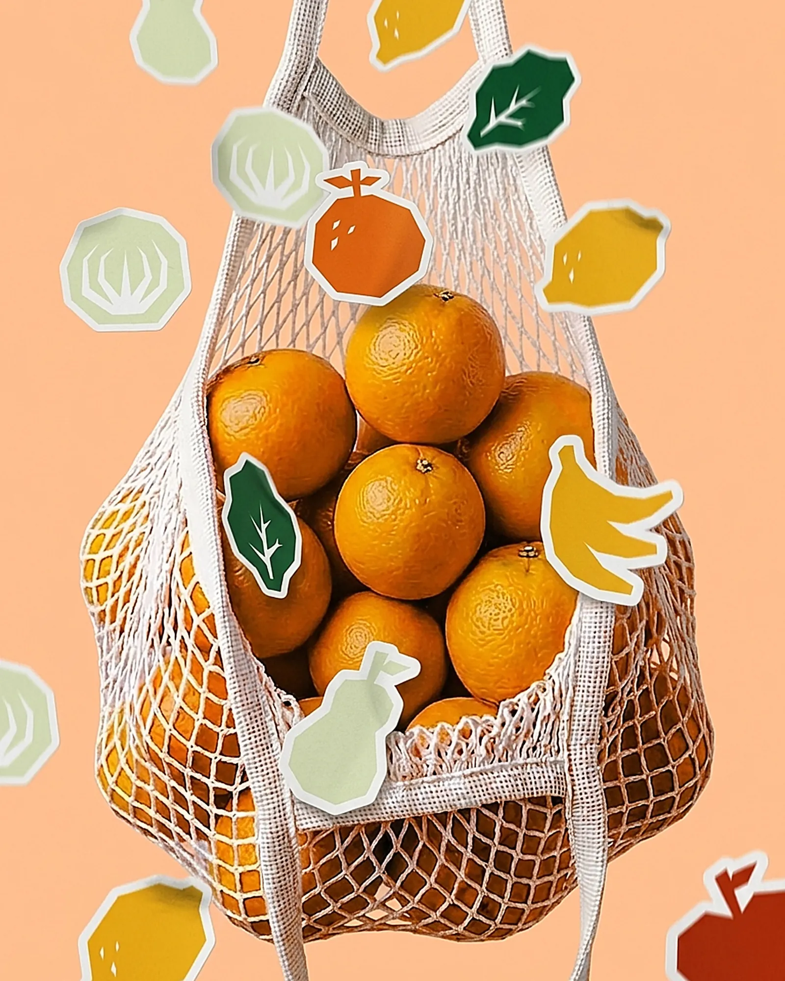
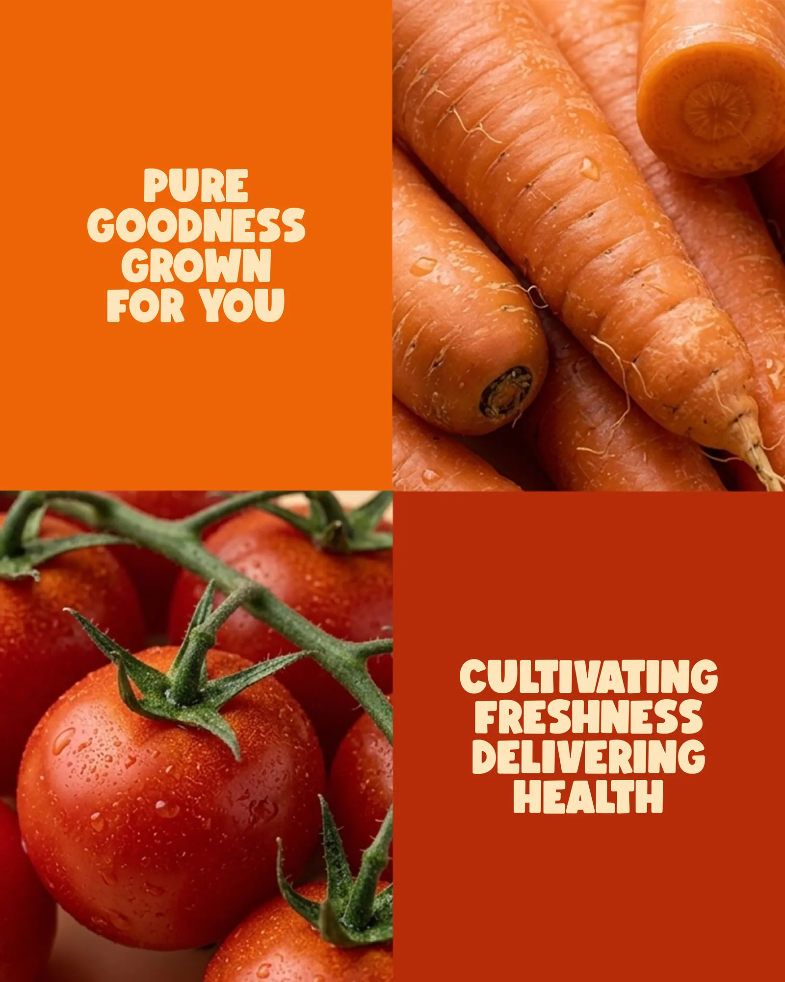
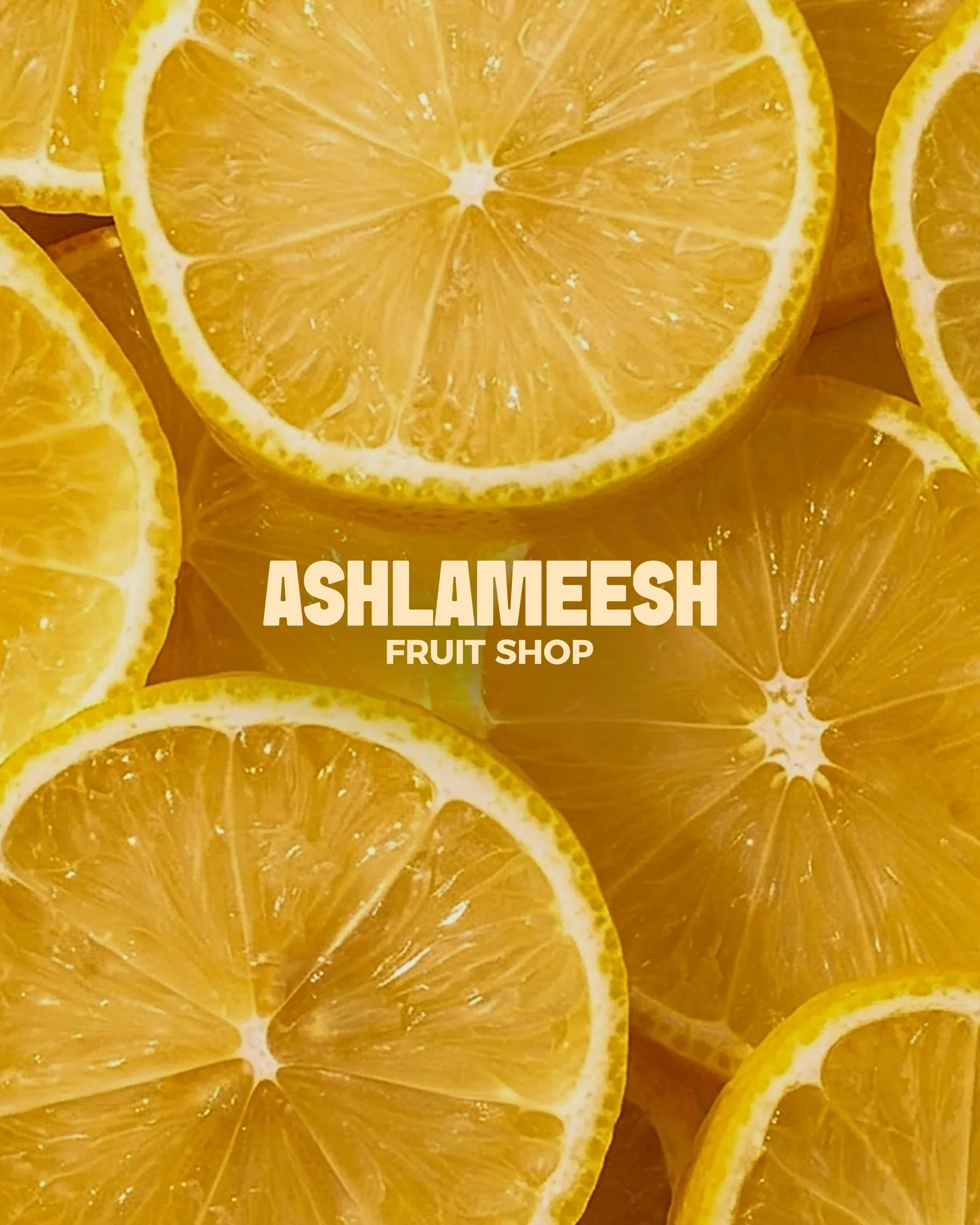
A fruit and cocktail store with one identity. Warm citrus colours, a family of illustrated produce badges, and photography that lets the fruit do the selling.
The Challenge
A fruit and cocktail store sits between two categories that rarely look alike. Grocers sell freshness and honesty, cocktail bars sell mood and indulgence. The identity had to hold both without becoming two brands.
It also competes in a room where the product is already the most colourful thing there, so the branding can't win by adding more colour.
The Approach
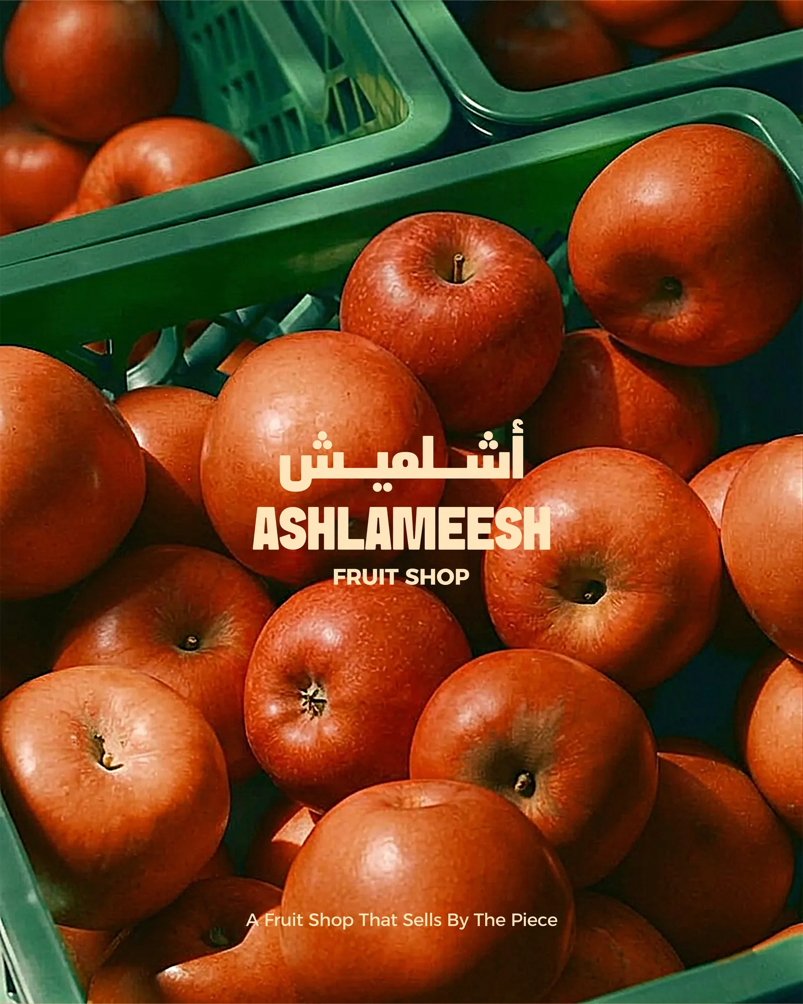
Photography leads: real fruit, warm light, minimal styling. Nothing a designer draws will beat the fruit itself.
Around it sits a family of illustrated badges, each drawn flat on the same geometric footprint. They give the brand something of its own that a photo can't, and they carry the playfulness the cocktail side needs.
The System
The positioning is stated plainly on the pack, a fruit shop that sells by the piece, in both Arabic and English. In Lebanon, a brand that works in only one language is half designed.
Every badge is built the same way, so the set grows easily. A new juice, season or cocktail gets a new badge, not a new brand. That matters for a menu that keeps changing.