Eartha
A circular fashion platform presented as a fashion brand, not an eco one. A fine serif wordmark, muted stone and olive, and photography that lets the garments carry it.
The Challenge
Circular fashion is a crowded category full of claims, and shoppers are sceptical of anything that tries too hard to look green.
Kraft textures and leaf motifs are the usual shorthand. They are also the quickest way to look like everyone else.
The Approach
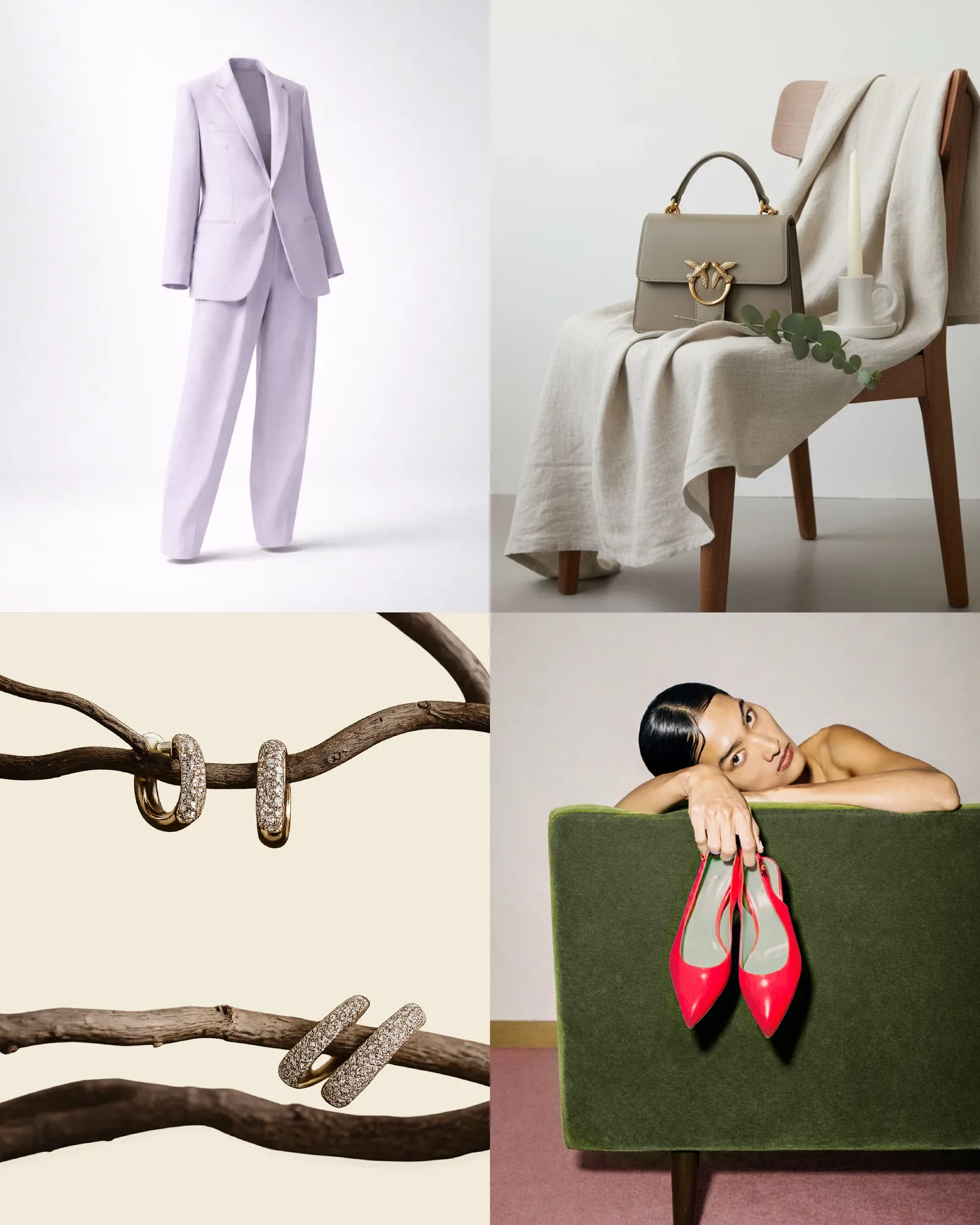
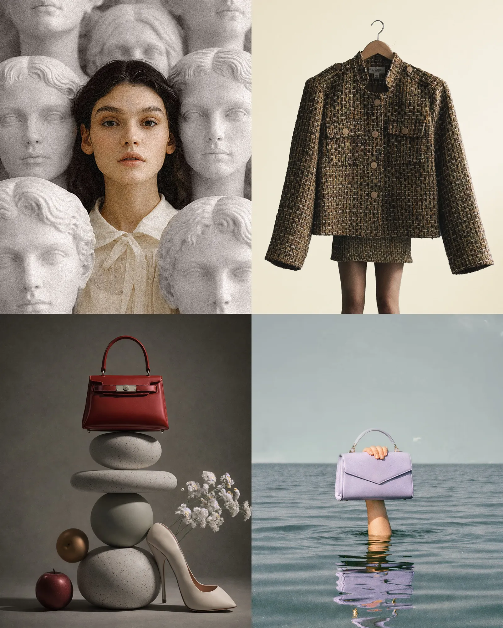
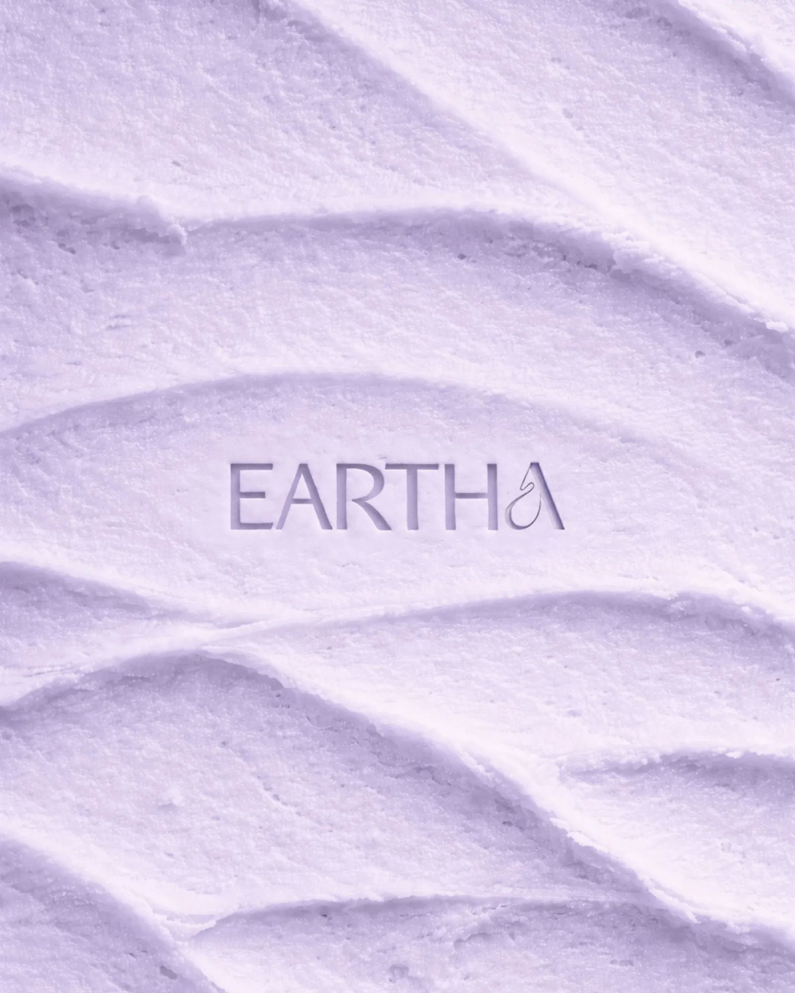
We dropped the eco visual language and treated Eartha as a fashion brand: a fine serif wordmark, generous letter spacing, and photography that shows garments the way a considered label would.
The colours stay in a narrow band of stone, chalk, olive and soft lilac. It is grown-up and tactile, closer to a boutique than a recycling scheme.
The System
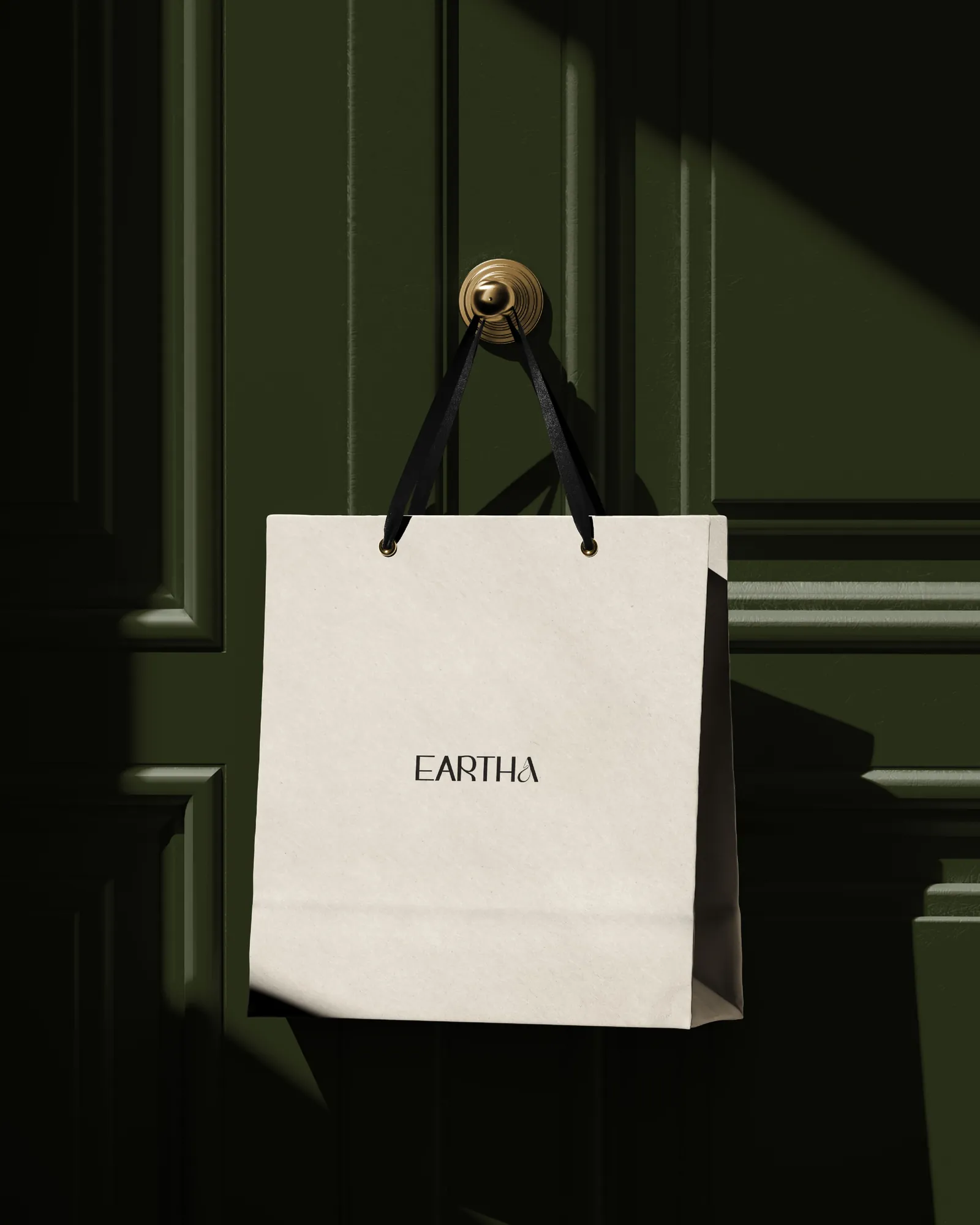
The identity stays restrained. Unbleached packaging reads as a material choice, not a cost saving. And because the brand never shouts about sustainability, the platform can prove it through what it actually does.