Blank Scale
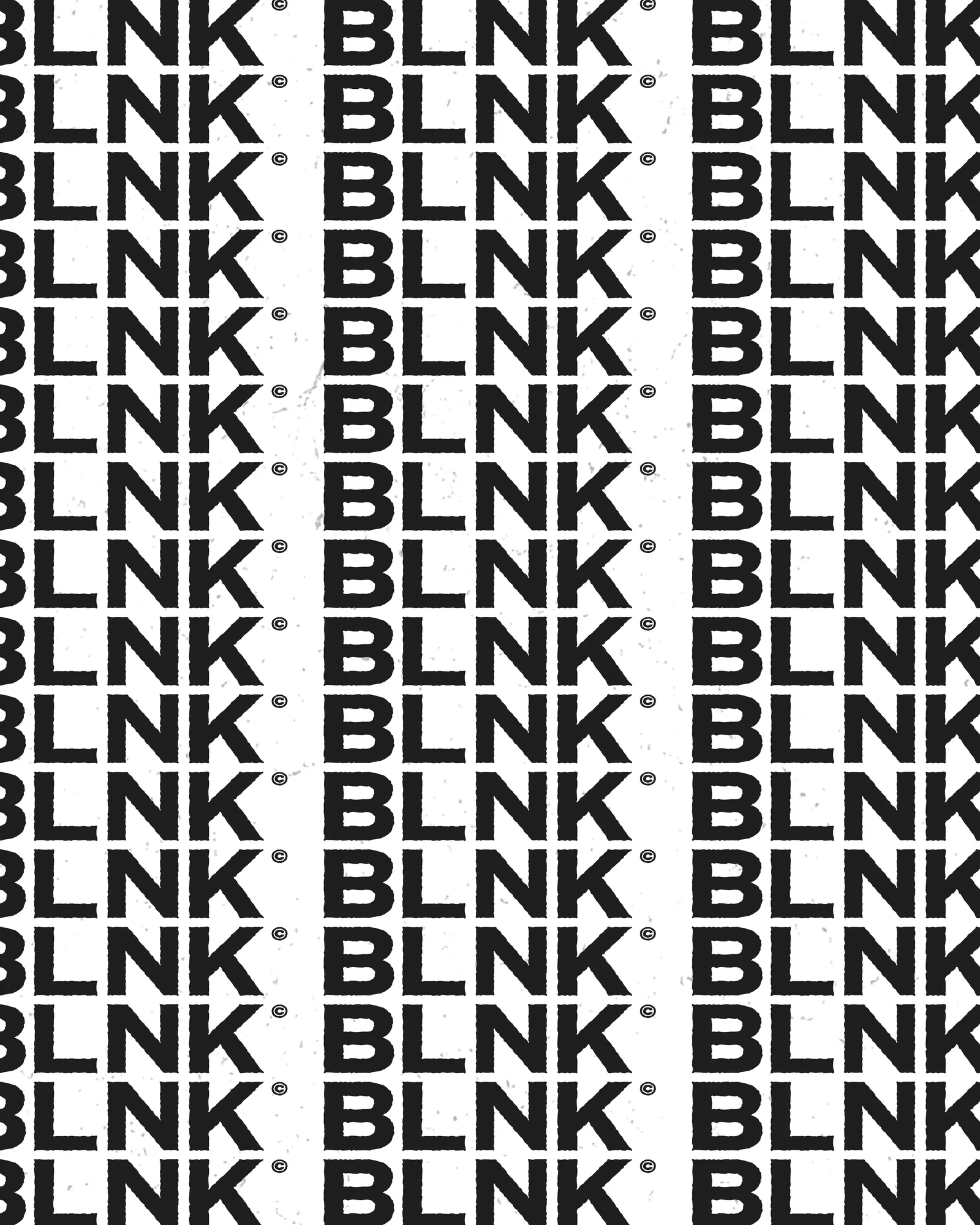
A studio identity reduced to its initials. BLNK repeats as a pattern in hard black and white, a surface that frames the work without competing with it.
The Challenge
A studio's own brand has a problem a client's brand doesn't: it can't outshine the work it frames. With too much personality, every project competes with its container.
It can't be invisible either. It has to stay recognisable across a portfolio, a deck, packaging and a storefront.
The Approach
We cut the name down to four letters and made that the idea. BLNK repeats as a typographic pattern, so the wordmark and the surface design are the same asset at different scales.
The palette stops at black and white and there is only one typeface. Every decision removes something, which leaves the work itself as the only place colour appears.
The System
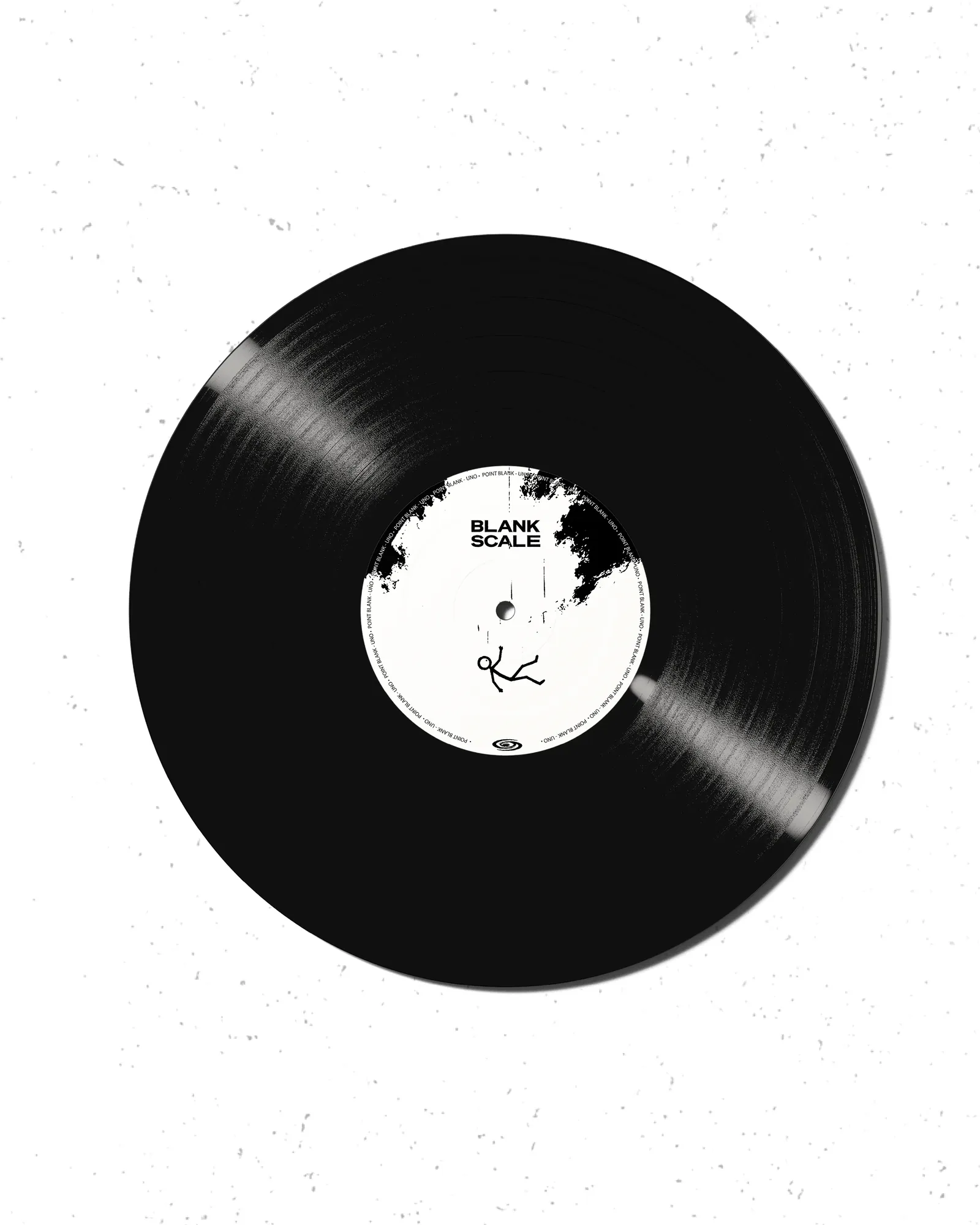
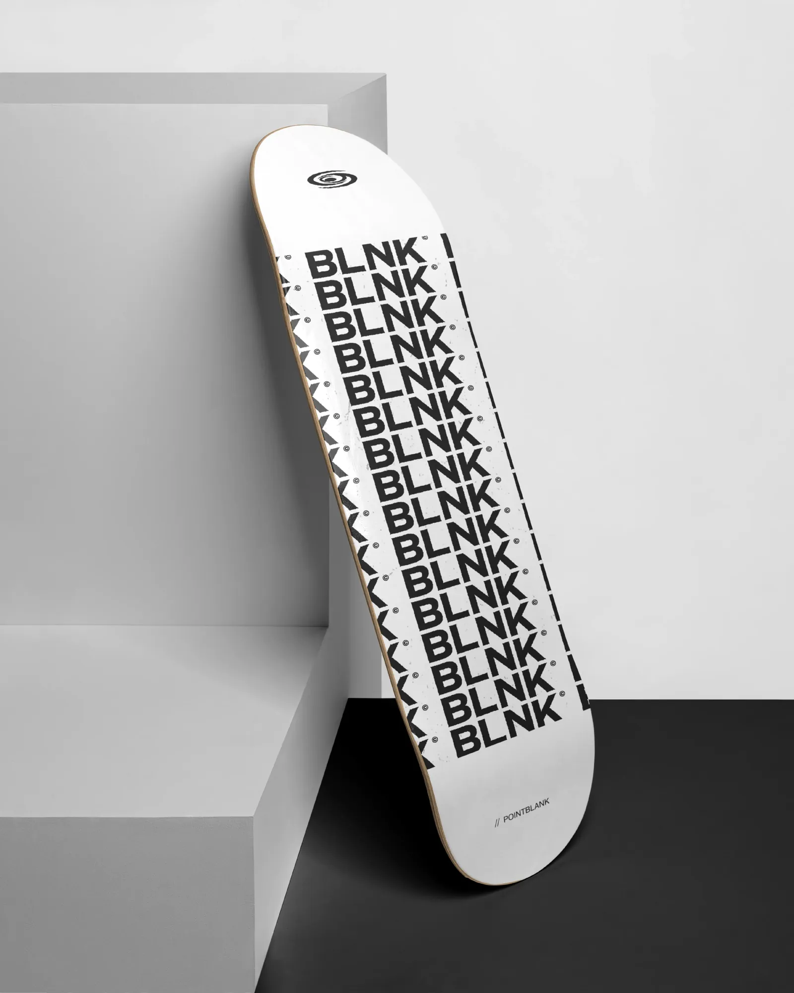
A single tile becomes a record sleeve, a skate deck, a wall or a screen without anything being redrawn. It scales without limit and prints in one colour, which matters for a studio making its own objects.