Sentinel
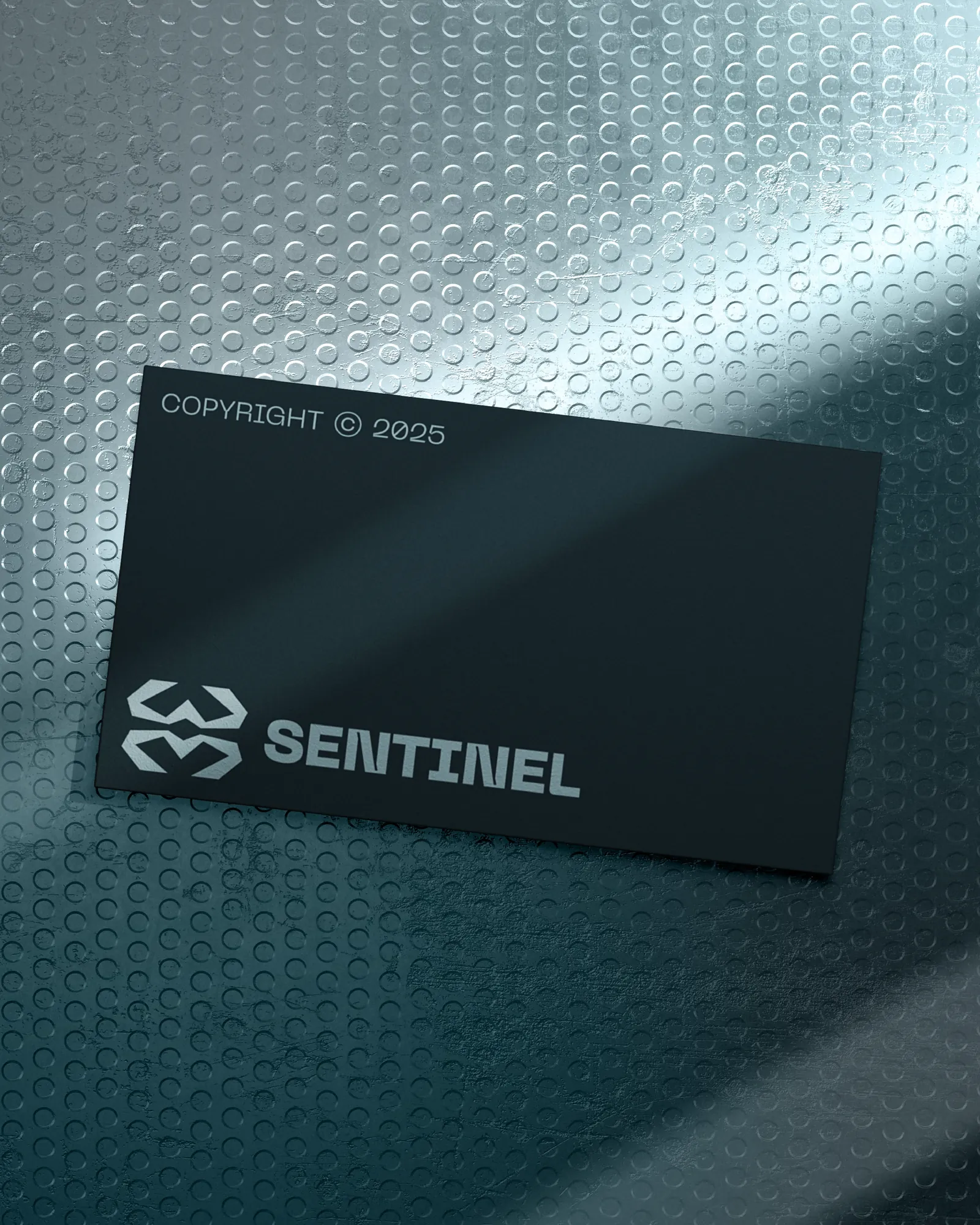
A drone security company's identity built on contrast: a sharp angular mark, near-black stock and cool metallic finishing. Precise, not tactical.
The Challenge
Security is bought on confidence. A drone security company asks clients to trust it with sites, assets and people, often before they have seen a demonstration. The brand has to do some of the persuading first.
It also has to look precise. Tactical styling is the obvious route, but it comes across as intimidating.
The Approach
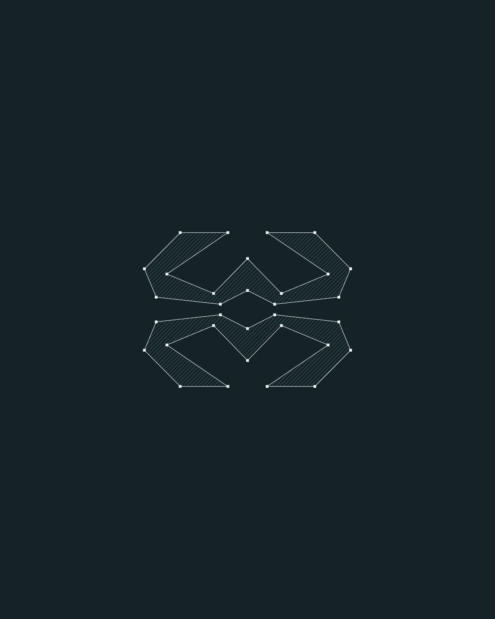
The mark is drawn from straight edges at one consistent angle, with no curves. The geometry suggests coverage and vigilance without using a shield, a target or an eye.
It sits on near-black stock with cool metallic finishing. The materials do part of the work: a restrained mark can carry a richer finish.
The System
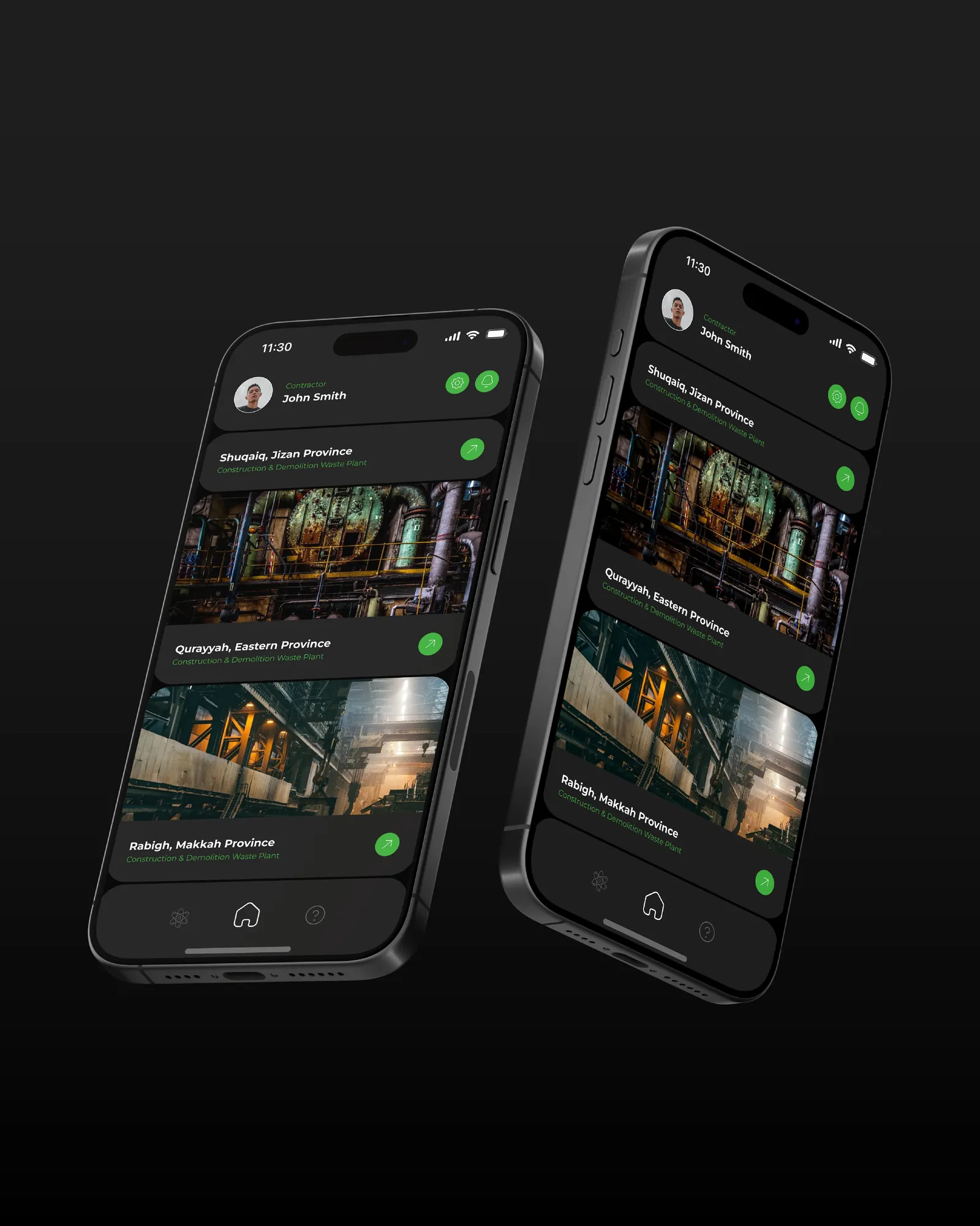
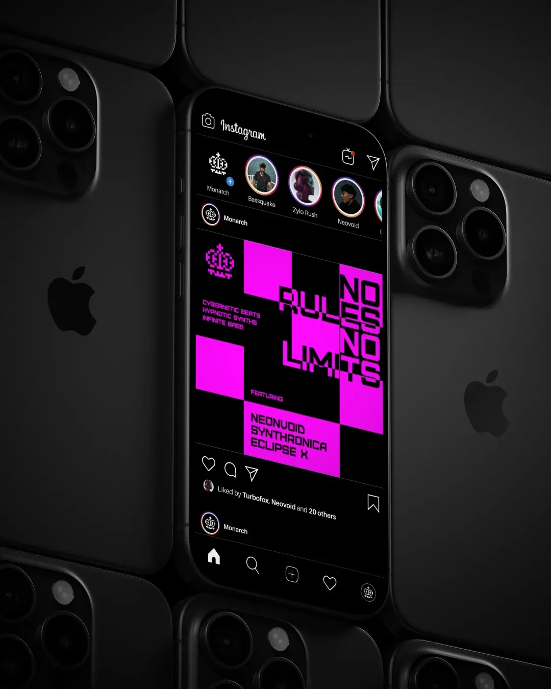
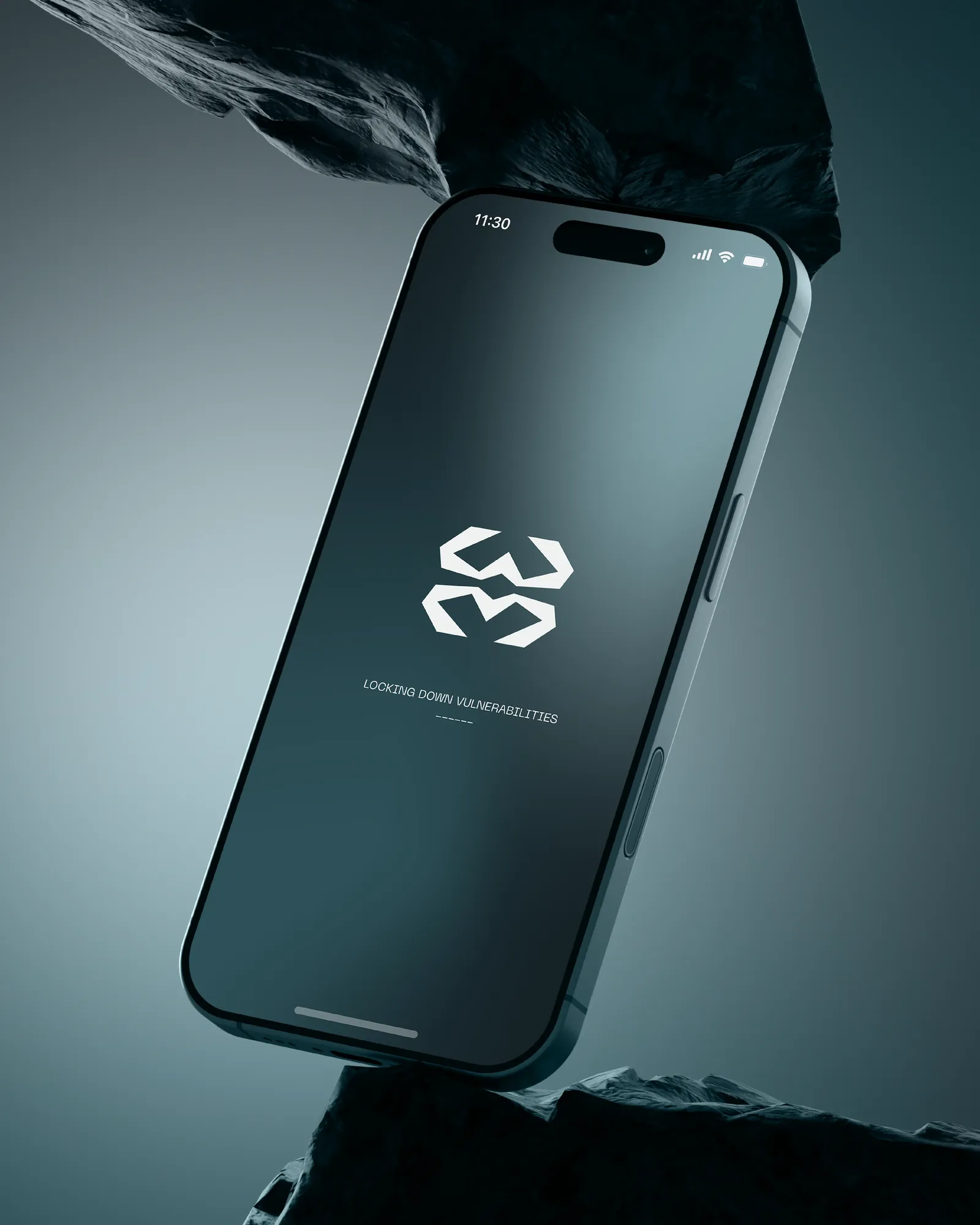
The mark is drawn on a strict construction grid, so every angle and node is accounted for. That lets it shrink cleanly: foiled on a card, embossed, or as an app icon on a phone, without redrawing a line.