Dizzy Lemon
A marketing agency that doesn't want to sound like one. The name is taken literally, squeezing lemons until they're dizzy, and that voice runs through a deep electric blue and oversized condensed type.
The Challenge
Marketing agencies tend to make the same claims in the same neutral blues and greys: data-driven, results-focused, full-service. A prospect can't tell one from another.
For an agency, the brand is the proof. If it can't make itself memorable, there is little reason to believe it can do that for a client.
The Approach
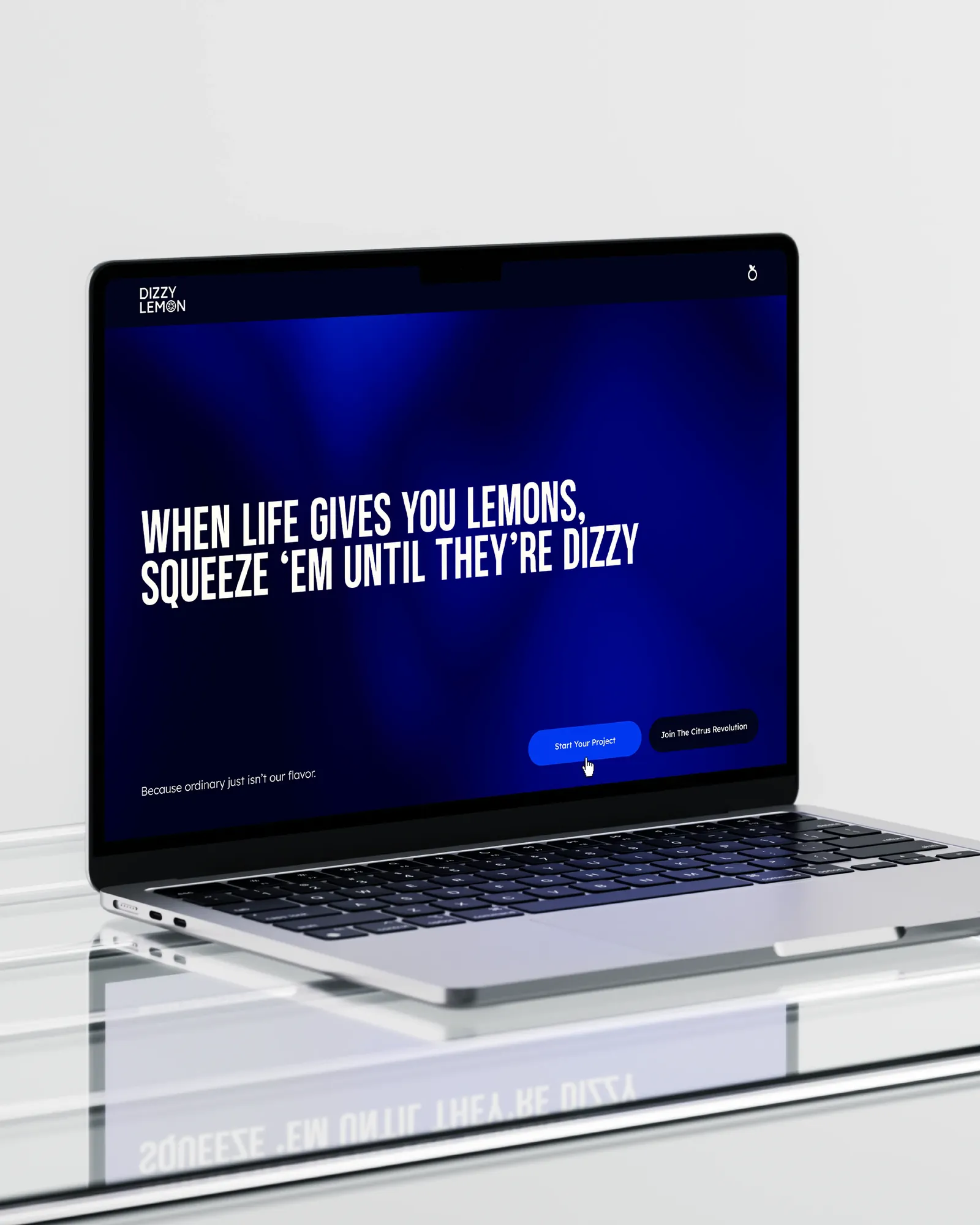
We started with the voice. The line came first: a tired proverb turned into a working philosophy, and the citrus theme runs through the copy without turning into a costume.
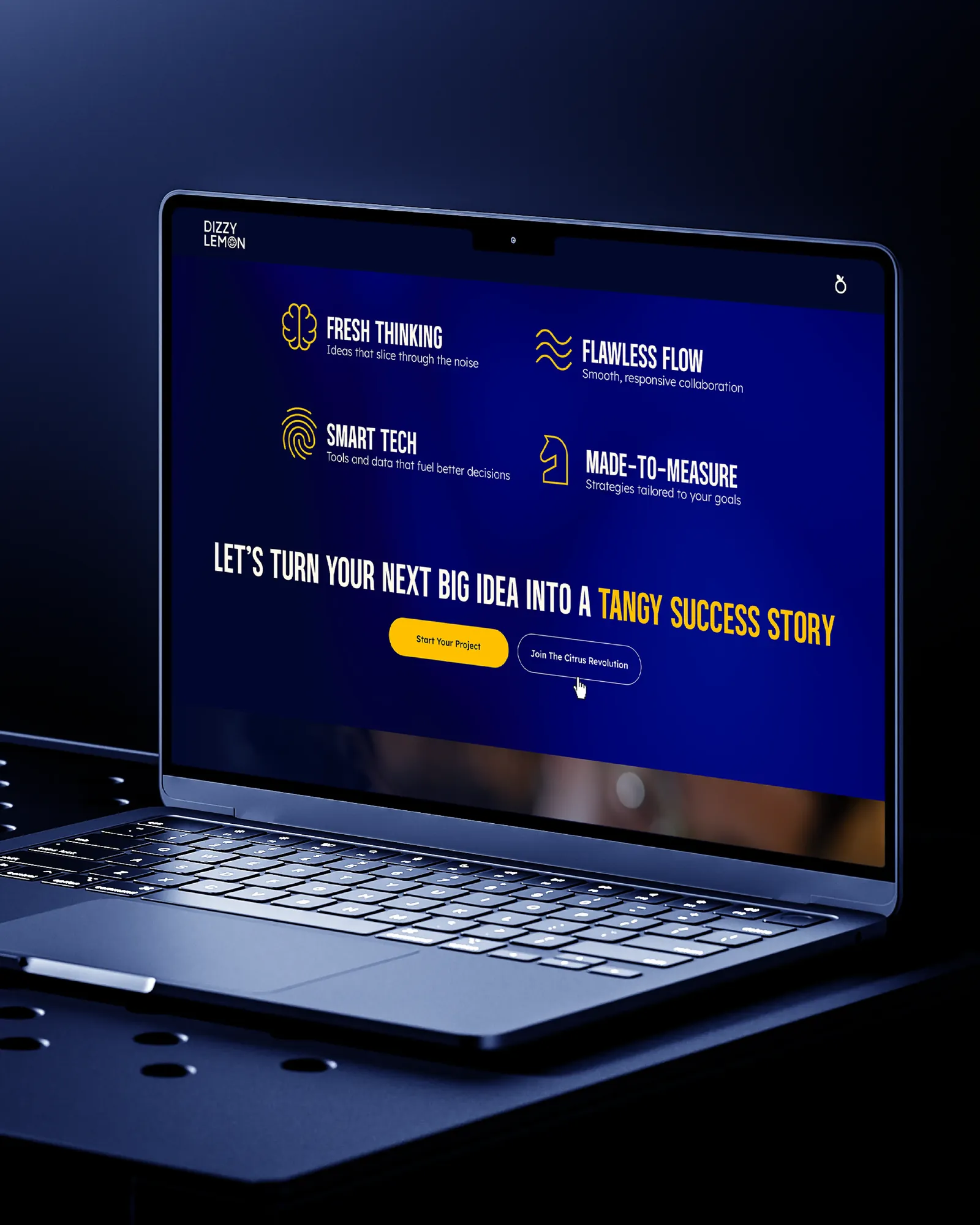
The visuals pull the other way on purpose: a deep, saturated blue and oversized condensed type. The tone is playful and the presentation is serious, because a client needs to smile and still trust you with a budget.
The System
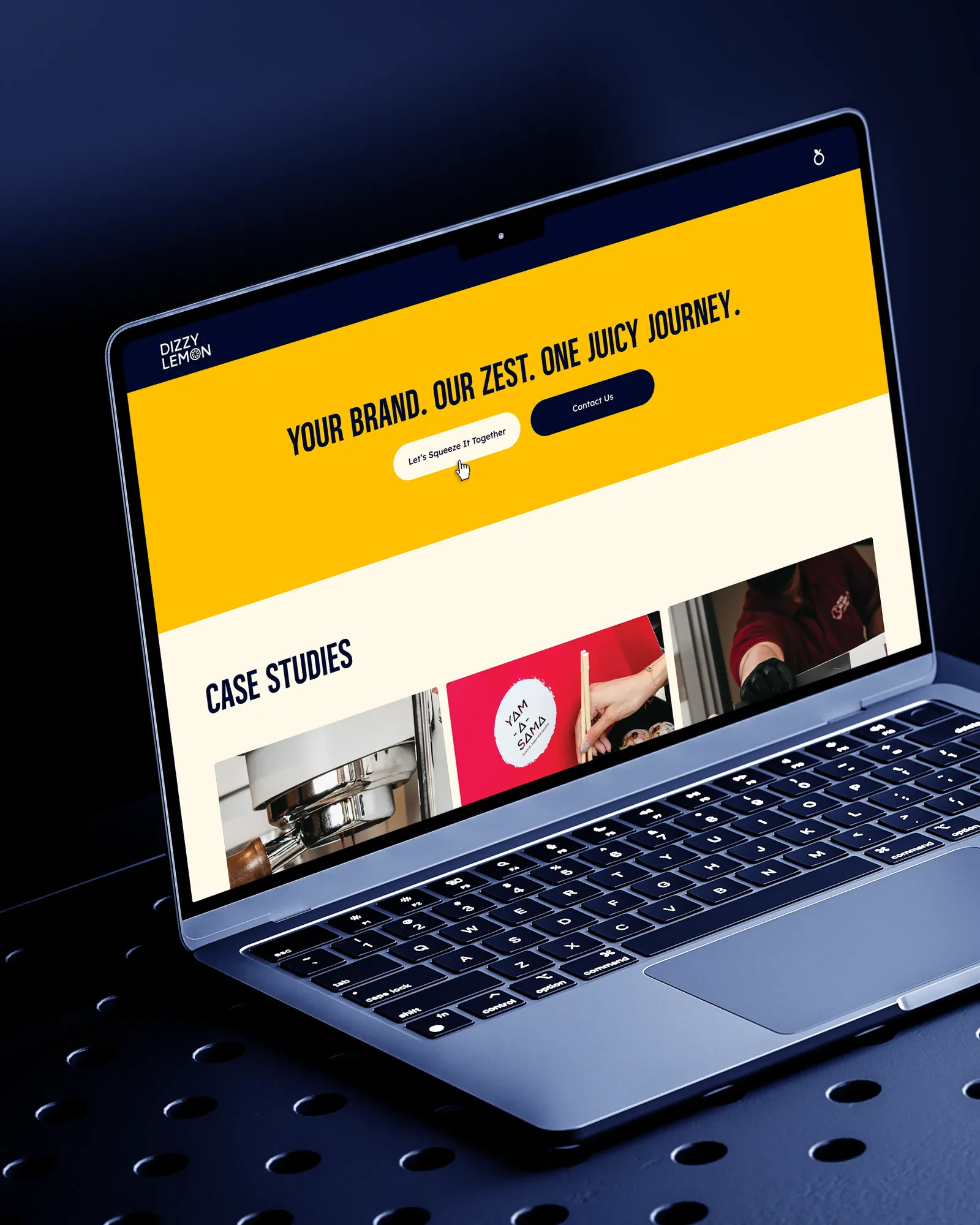
Propositions are set as short pairs, so the site can be scanned in seconds. The identity comes with fixed colour values, a type hierarchy and voice rules, so every proposal and post sounds like the same agency.