Sizzling Shack
A fried chicken brand built on a rooster drawn in two shapes. Hot red and yellow, a repeating character pattern, and close-up food photography that runs from the wrapper to the feed.
The Challenge
Fast food is decided in a fraction of a second, scrolling past a post or picking up a wrapper. The brand has to make people hungry before they read anything.
It also has to print on greaseproof paper and cardboard clamshells, where fine detail and subtle colour don't reproduce.
The Approach
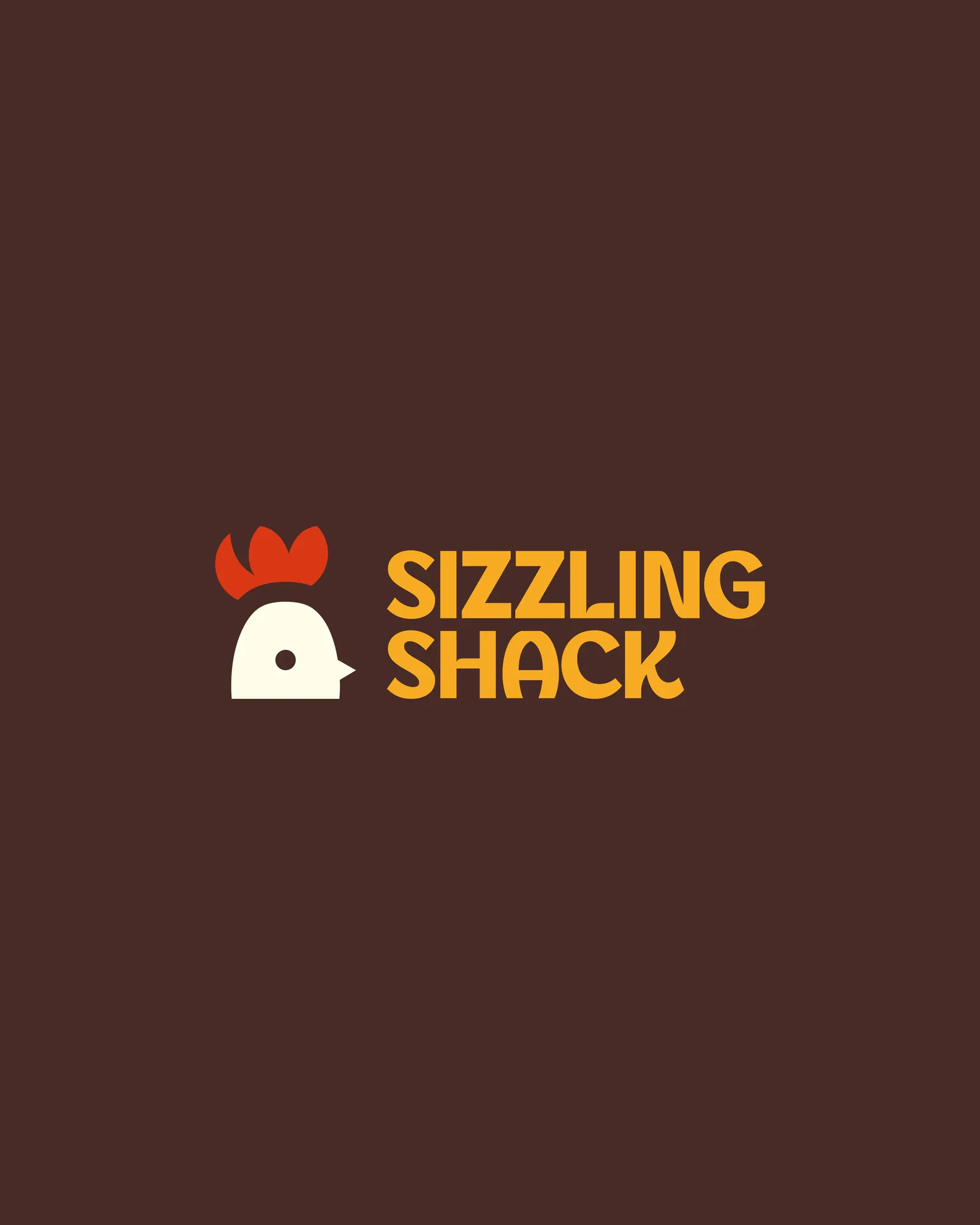
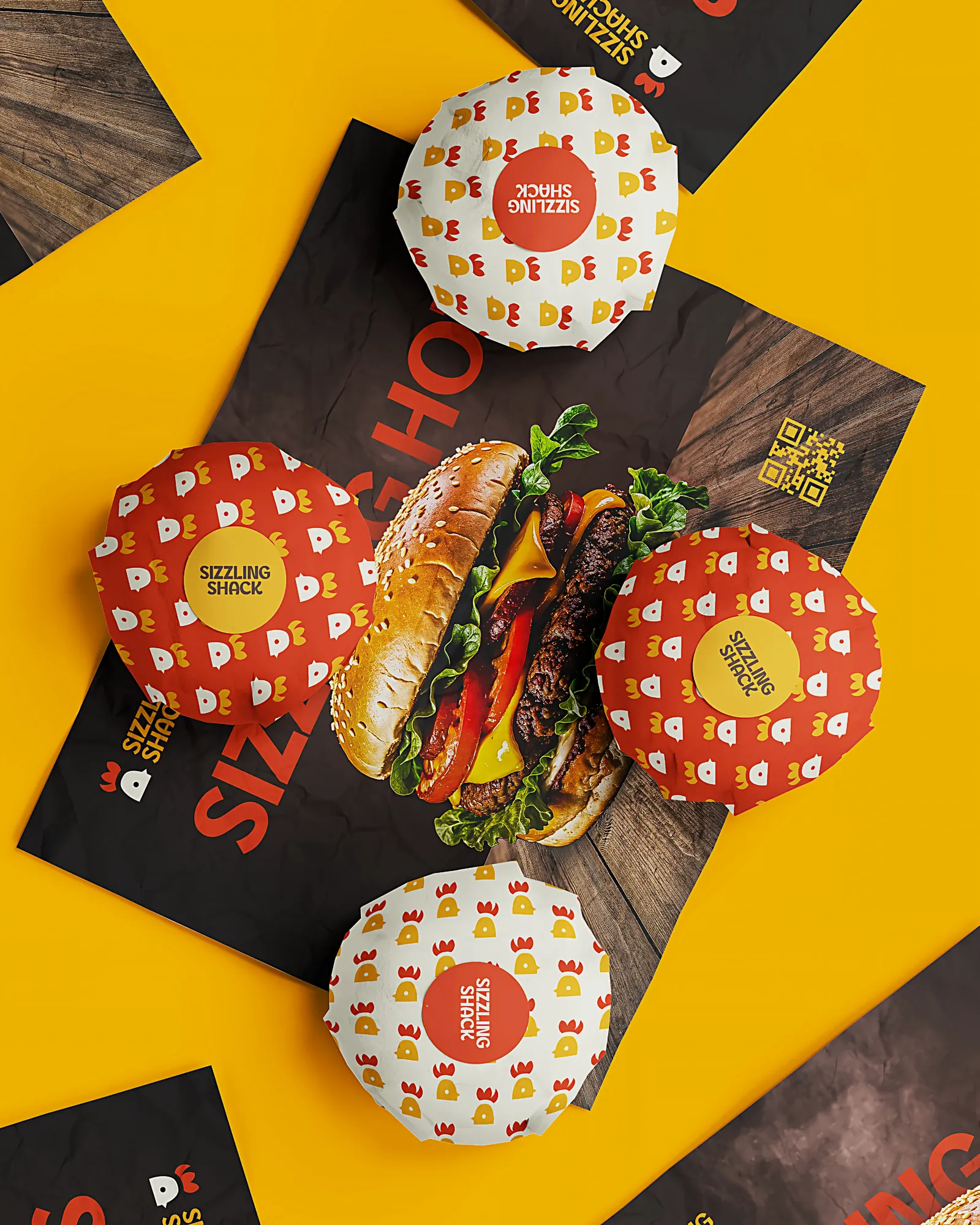
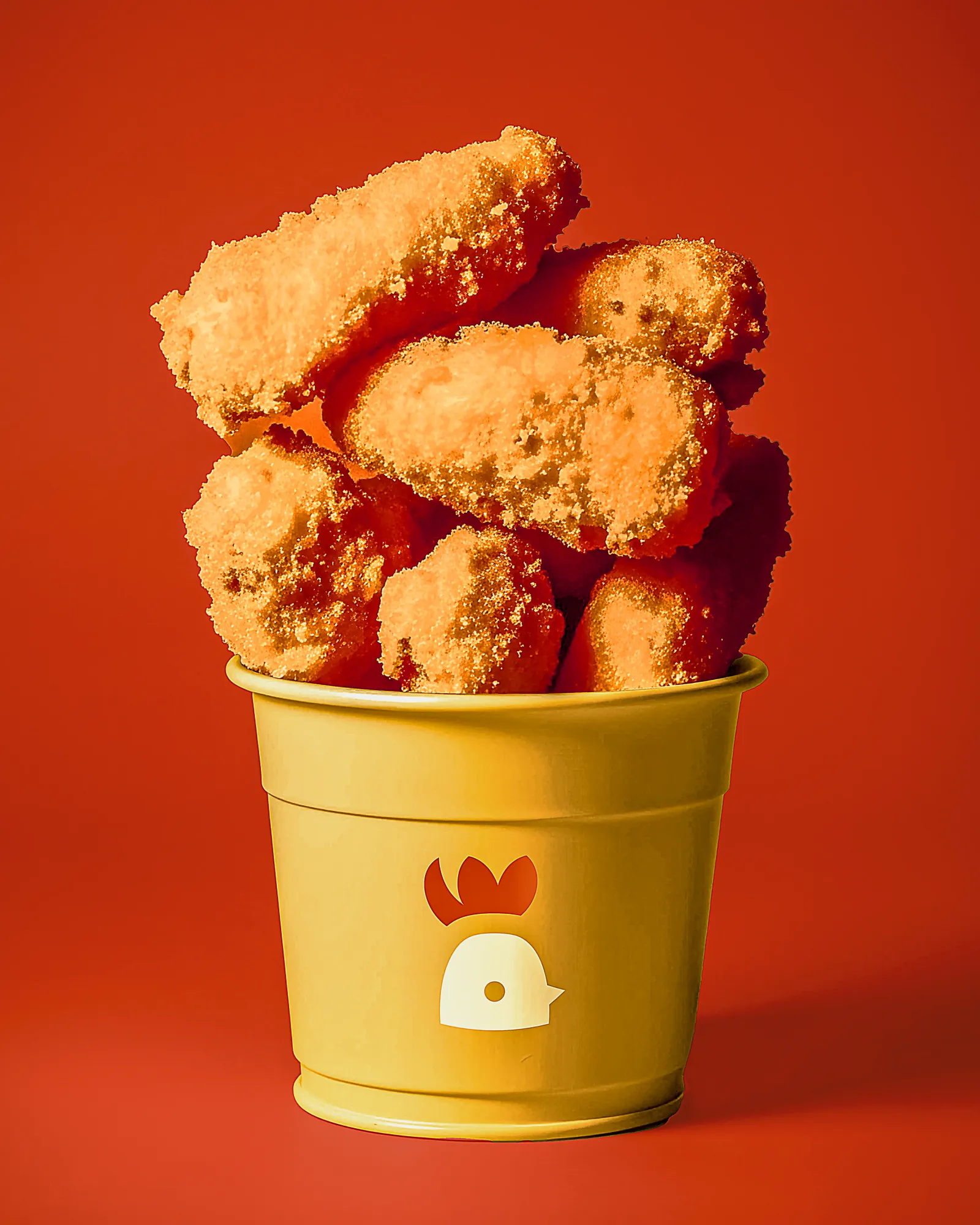
The mark is a rooster reduced to two shapes, a red comb and a yellow body, with a single counter for the eye. No outlines and no gradients, so it prints in flat colour on any material and stays recognisable at wrapper size.
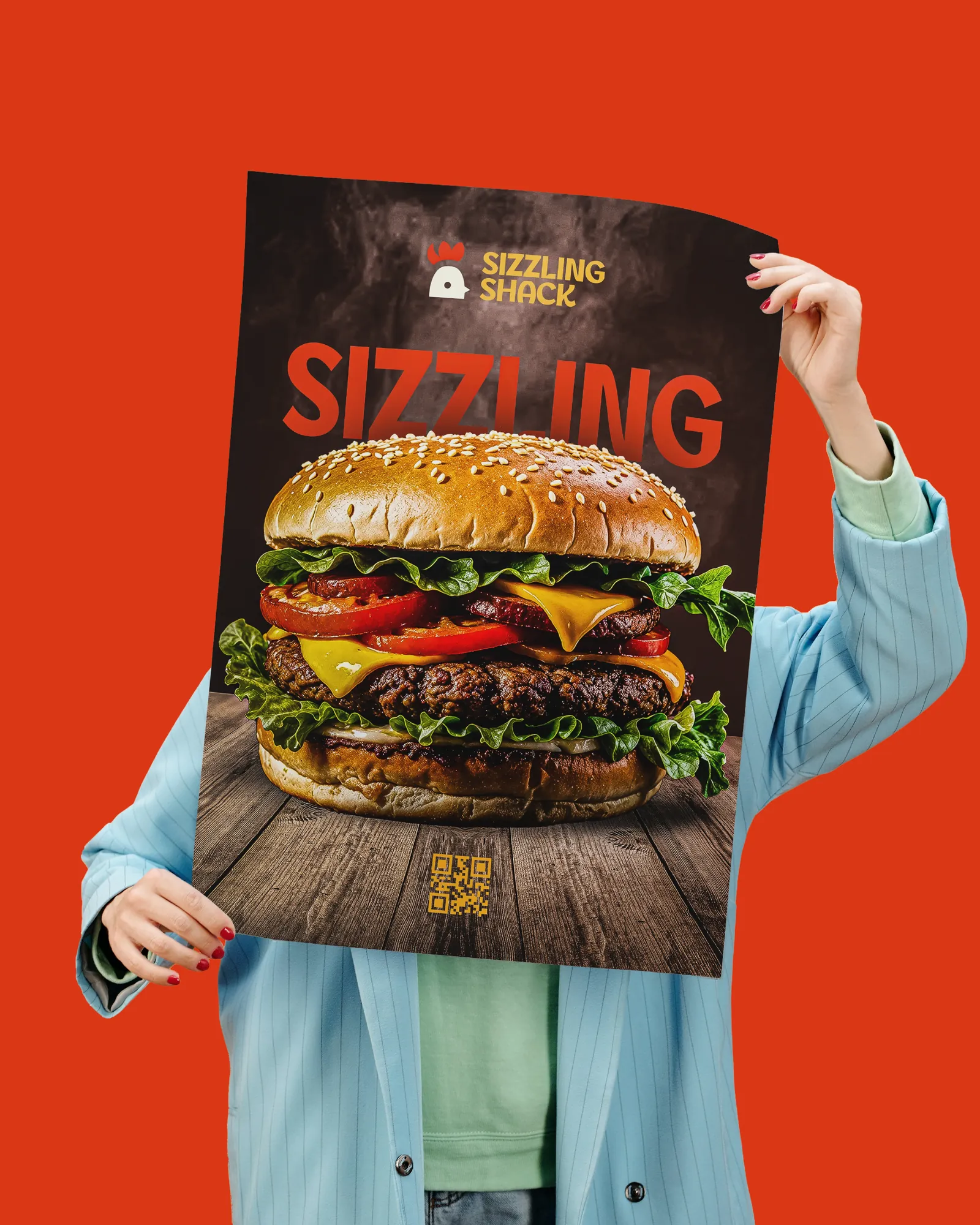
Hot red and yellow give the brand immediate heat, and heavy rounded type holds up at thumbnail size where lighter fonts disappear. Photography does the rest: close crops, hard light and food filling the frame.
The System
Because the mark is two flat shapes, it tiles into a pattern that turns any blank surface into packaging: wraps, liners, bags and boxes all come from one asset. The same pattern and type rules carry into social media, so a new offer can go out on-brand in minutes.