Monarch
A bass music label built on a pixel crown and a checkerboard grid. Cyan, magenta and acid green on black, in a system that runs from a vinyl sleeve to a pasted-up wall.
The Challenge
A label has two jobs that pull against each other. Its releases and events look different on purpose, because the artists are different. But the label itself has to be recognisable on every one of them.
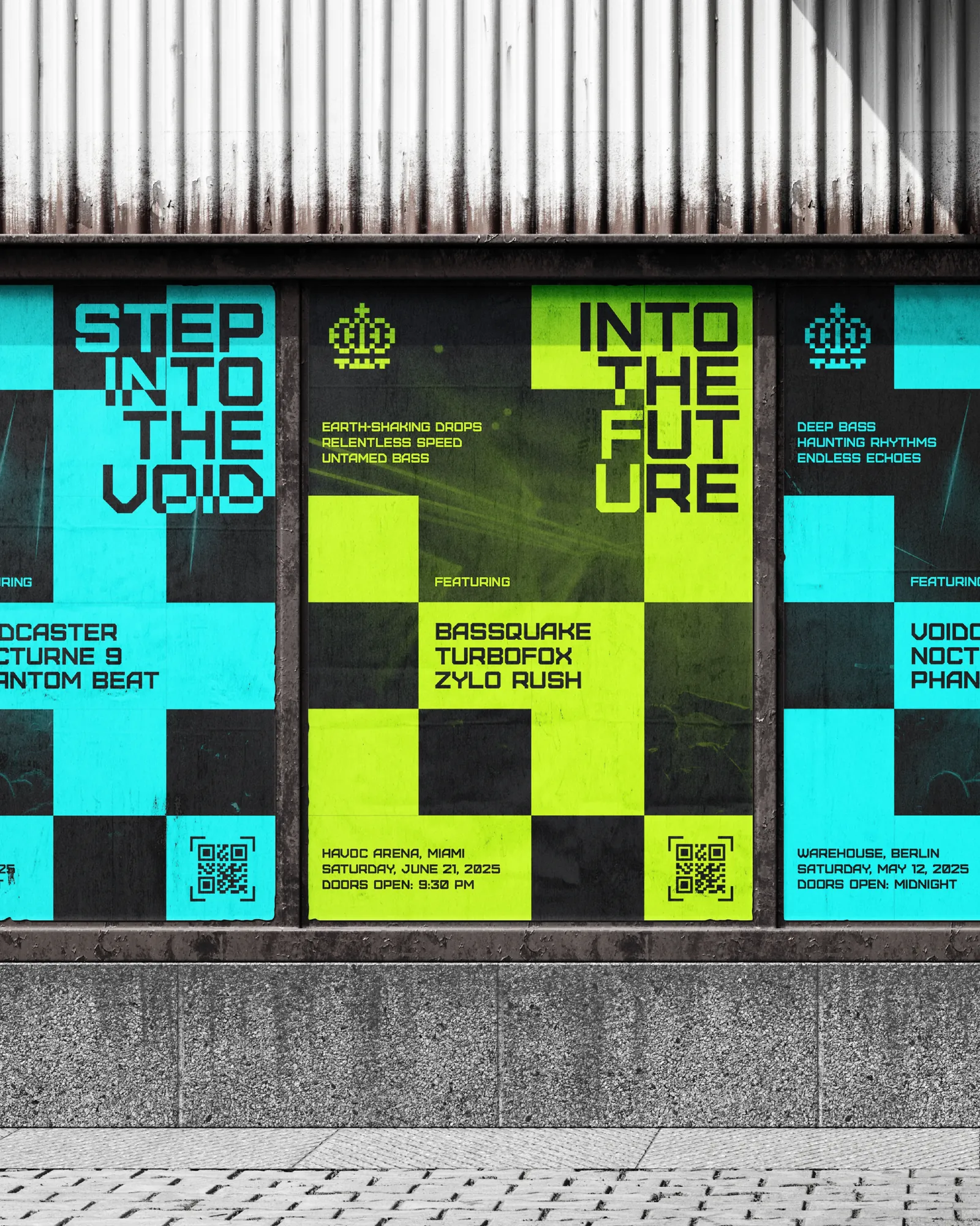
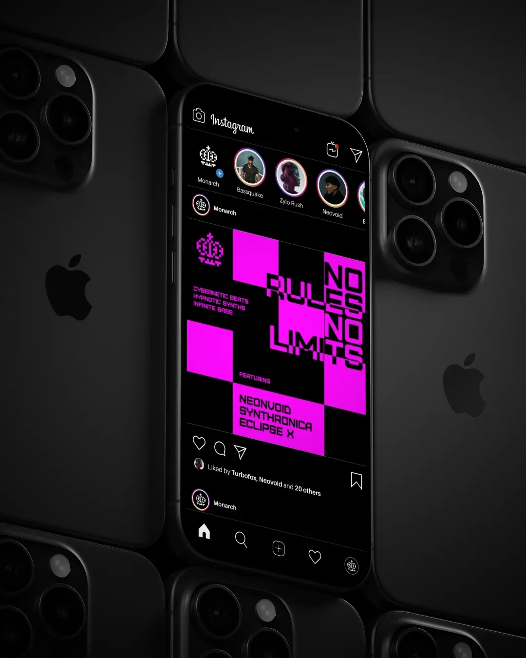
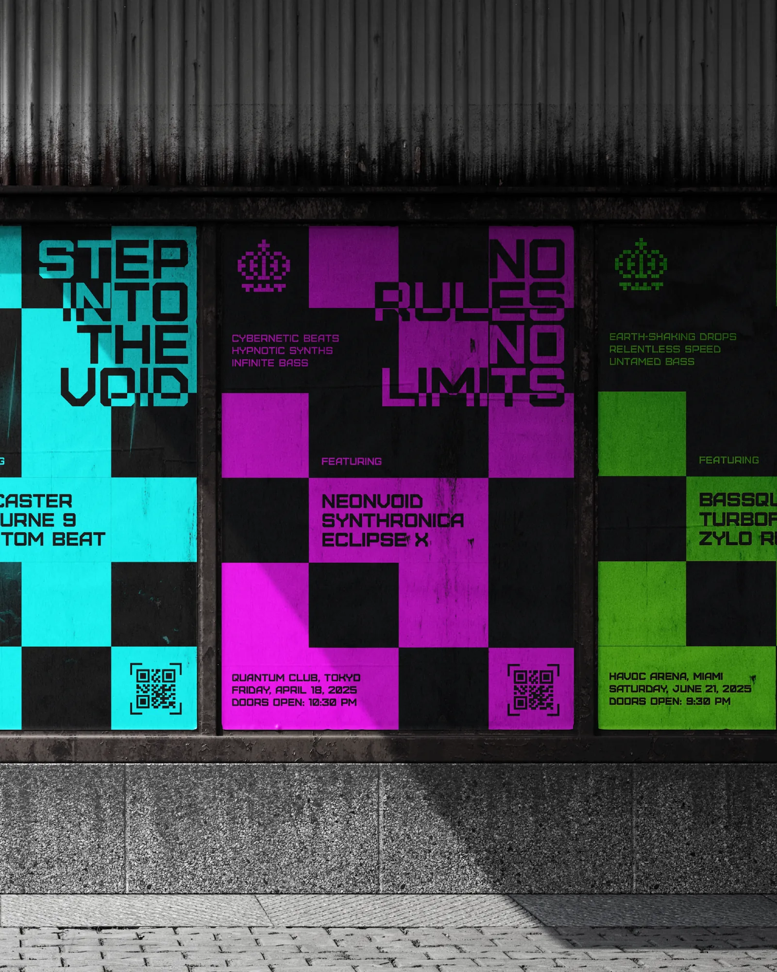
It is also seen in two very different places: a phone screen at thumbnail size, and a wall of pasted posters glimpsed from across a street.
The Approach
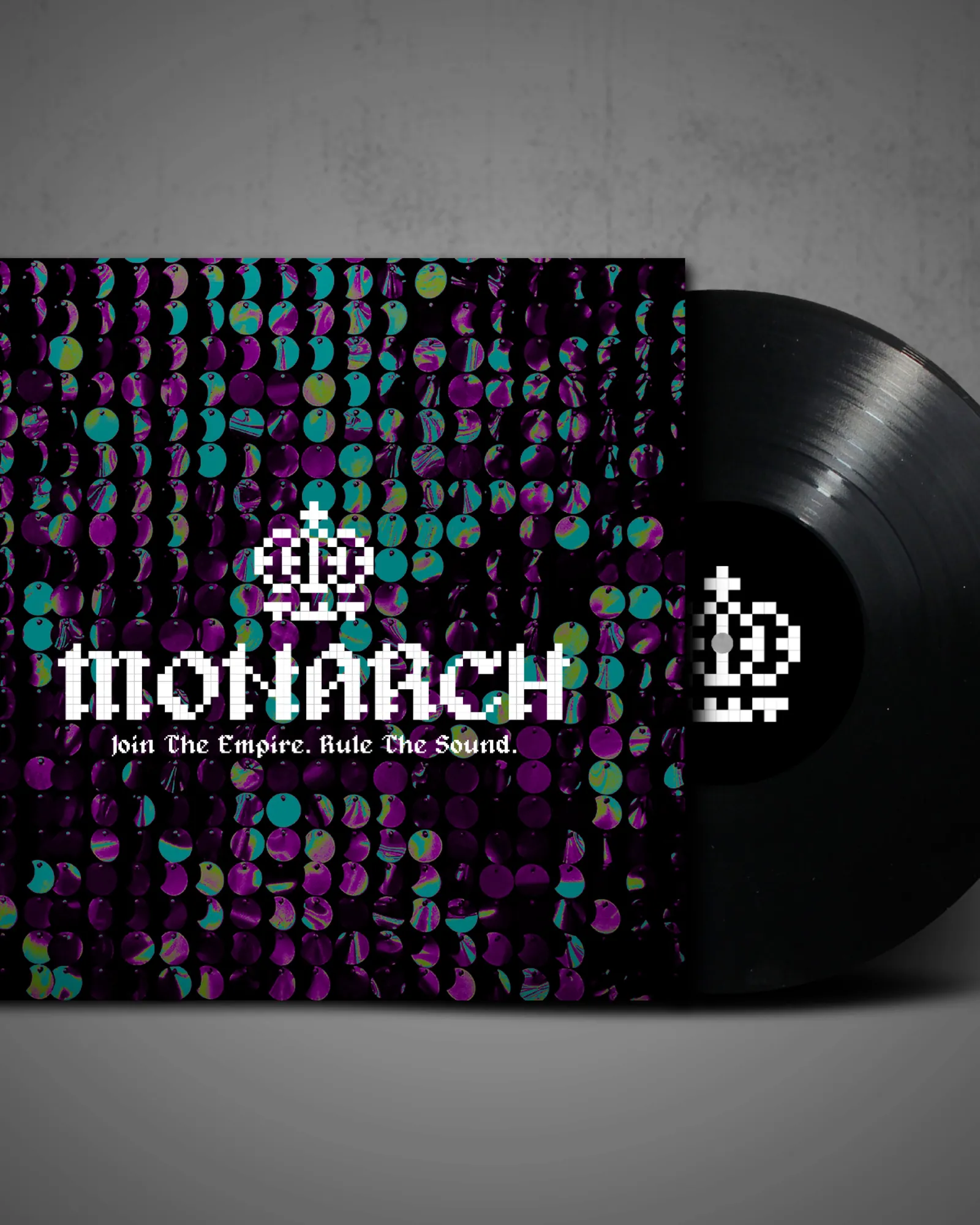
A pixel-drawn crown and a matching bitmap wordmark give the label a mark that is clearly digital in origin, which suits electronic music and stays legible when reduced to a handful of pixels.
The layout is a checkerboard grid. Cells hold type, colour or image in any order, so every poster looks like part of the same system without repeating a layout. Cyan, magenta and acid green sit on black and can be reshuffled for each release.
The System
One grid produces a vinyl sleeve, an event poster, a story frame and a paste-up. Artist names, venues and dates drop into fixed cells, so a new show is a content change, not a design job. That suits a release schedule.