YDA HVAC
Brand identity and website for an HVAC contractor run by a registered professional engineer. The mark is three ducts stepping through a wall, built to be read from a distance on a van, a cone or a high-vis vest.
The Challenge
Most air conditioning companies look alike: a blue gradient, a stock photo of a wall unit and a phone number. That makes every installer look interchangeable.
YDA is different. It is run by a registered professional engineer, and the work covers compliance documentation, kitchen exhaust design and installation to specification for schools, kitchens and healthcare sites. Looking like a two-van installer would cost it the commercial work it is qualified for.


The Approach
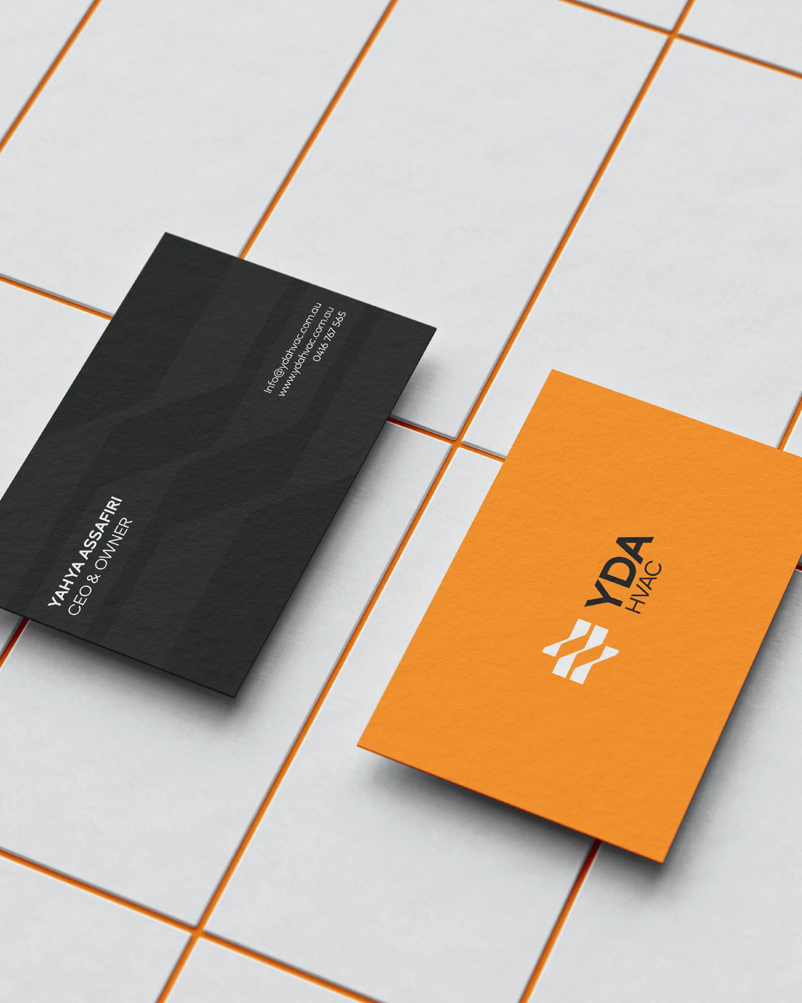
The mark comes from the work itself: three horizontal bars, each stepped through a diagonal, like a duct run offsetting around a beam. Anyone sees movement, and anyone in the trade sees ductwork.
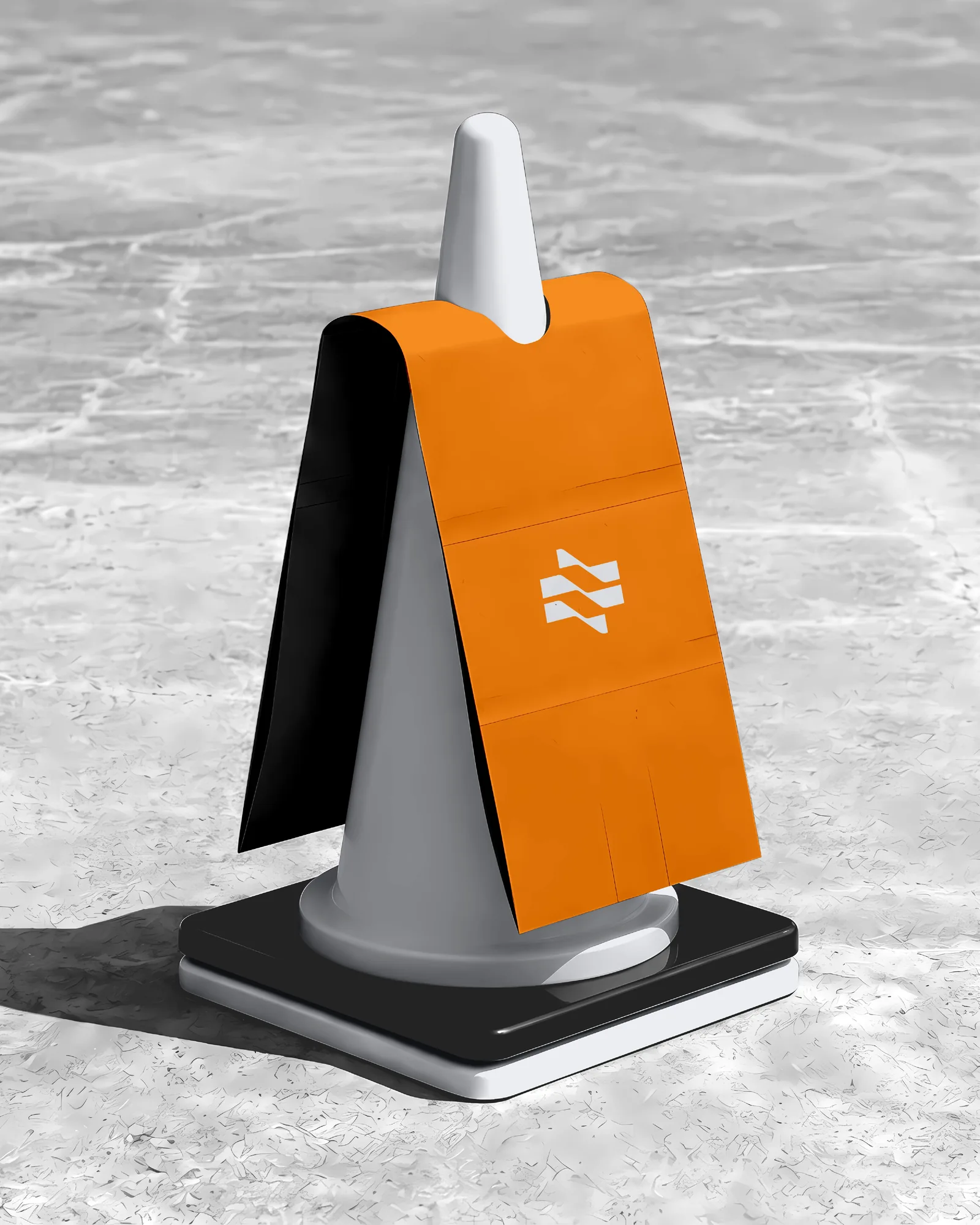
The colour is a single safety orange against near-black and cool grey. It is already on every site the company works on, and it stays visible on a cone, a lanyard or a polo shirt in daylight.
The System
The mark had to work small, in one colour and stitched, so it is built from flat bars with no gradient or fine detail. It appears here embroidered on workwear, printed on a cone sleeve, foiled on a card and as an app-sized square, all from the same shapes.
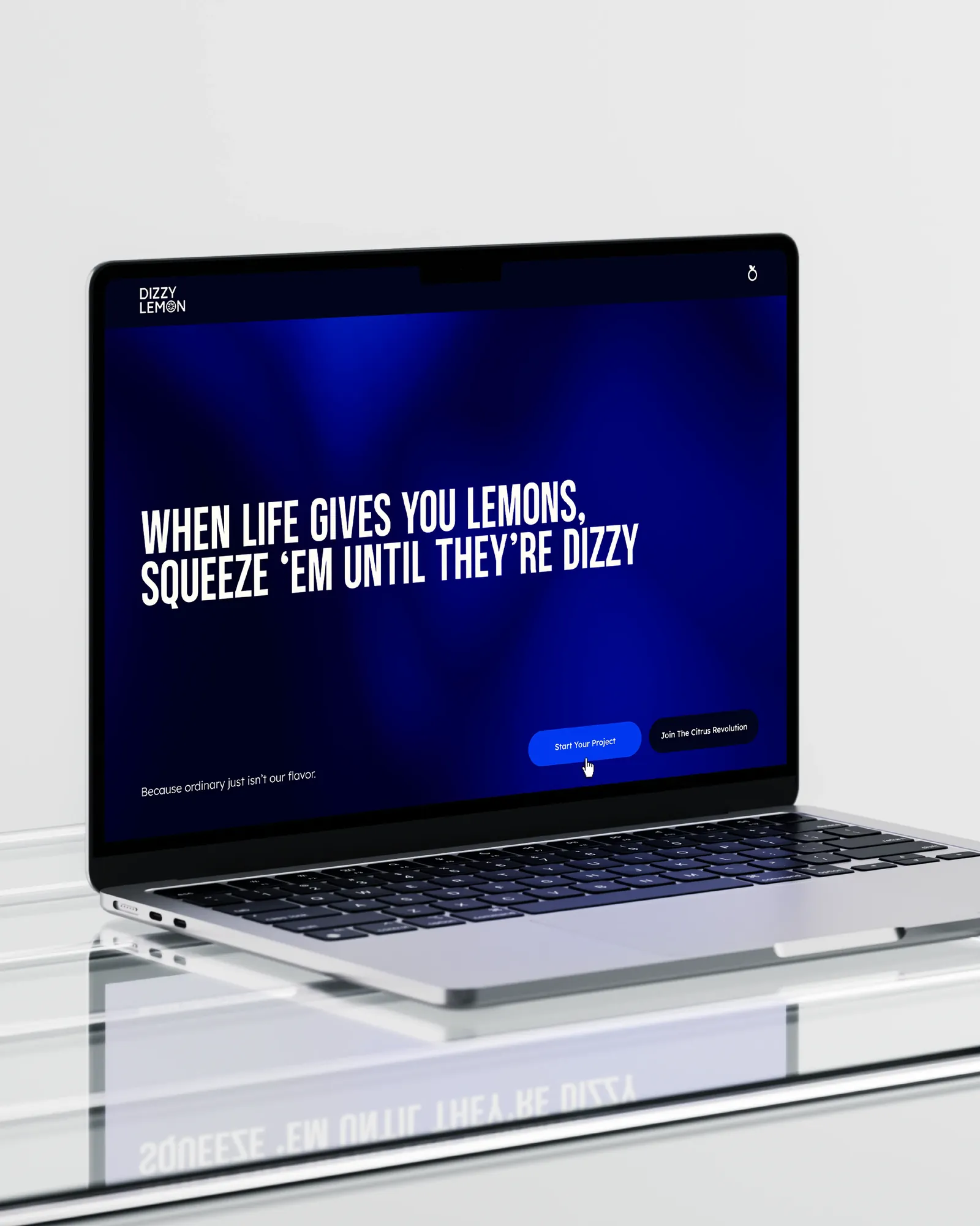
The website covers what a logo can't. The first screen states the engineering-led approach, the professional-engineer registration and the service area, before any product. The identity gets attention, and the site makes the case.