NYX Premium Bar
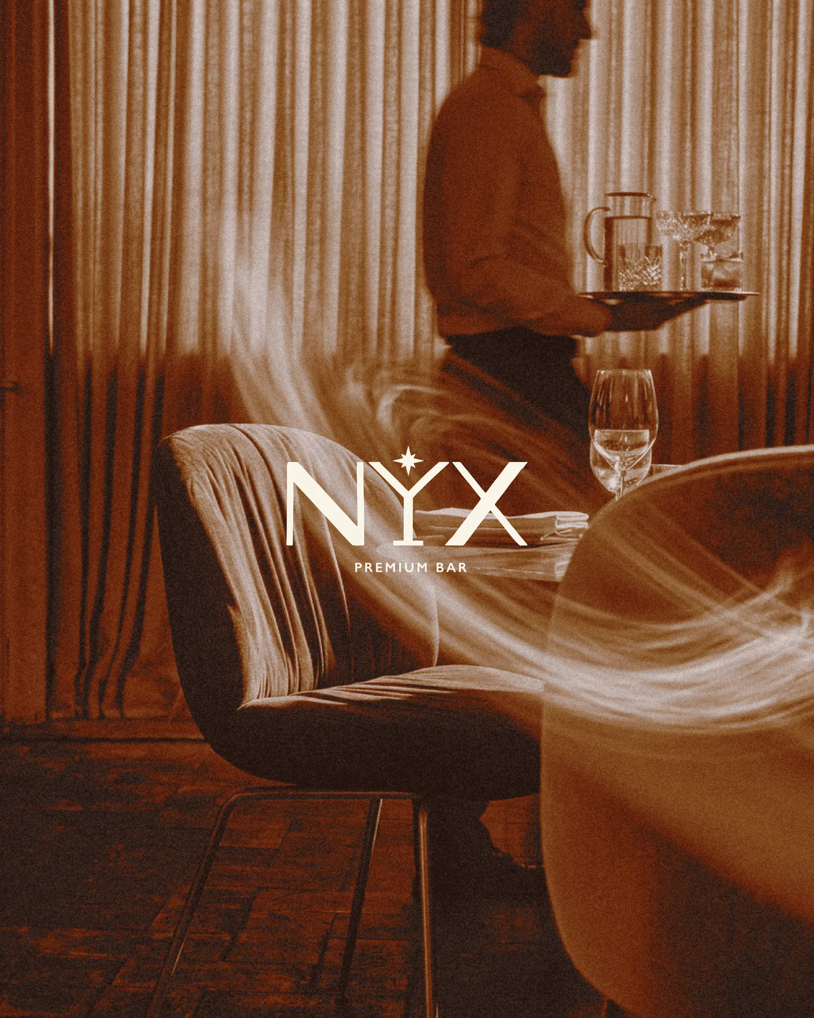
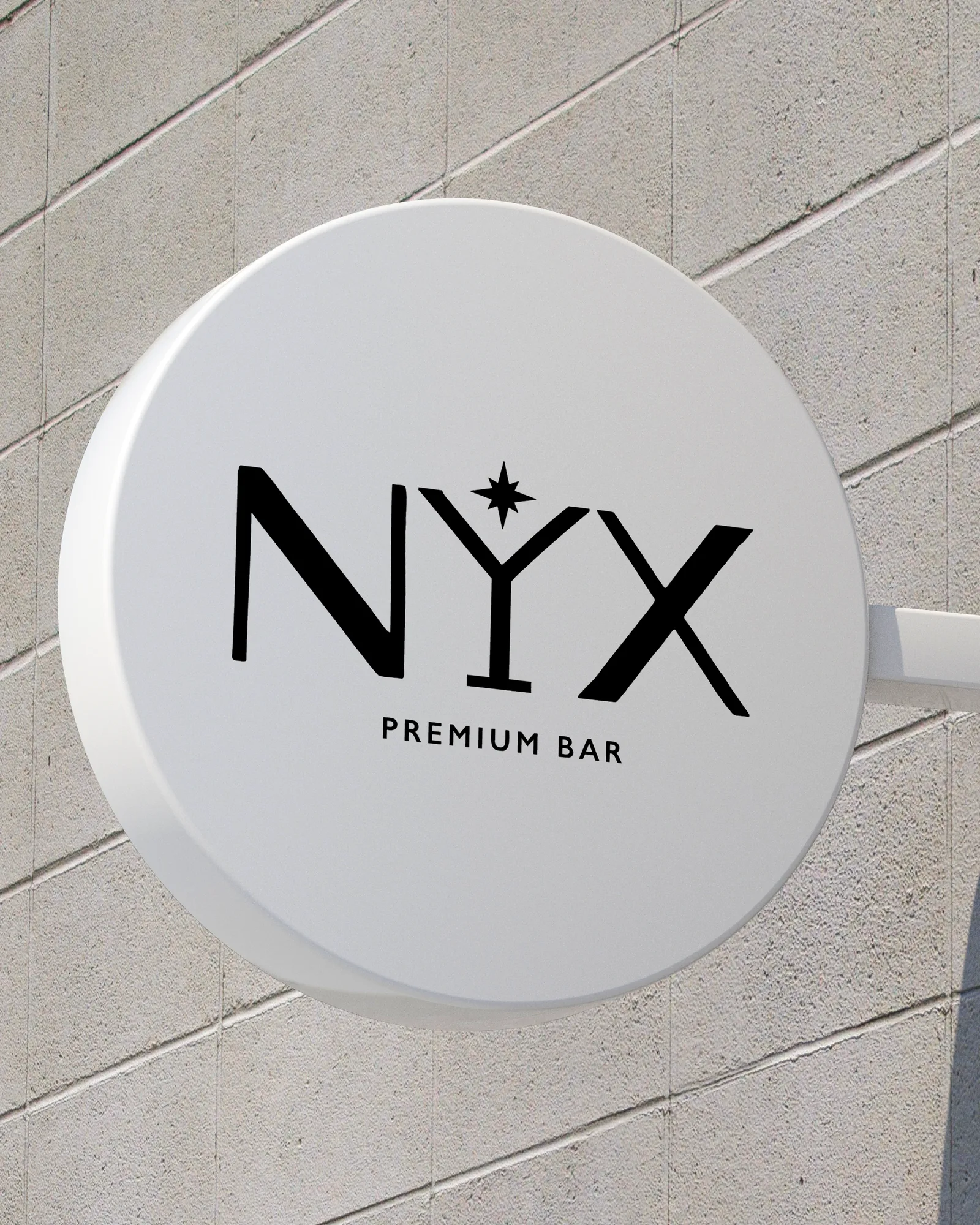
A cocktail bar named after the goddess of night. The Y in the logo is a martini glass with a star above it, and the colours stay in the warm, low tones of a room lit at night.
The Challenge
Premium bars often look the same: gold on black, a widely spaced serif and a mark that could belong to a whisky, a watch or a hotel. It looks expensive but doesn't look like any place in particular.
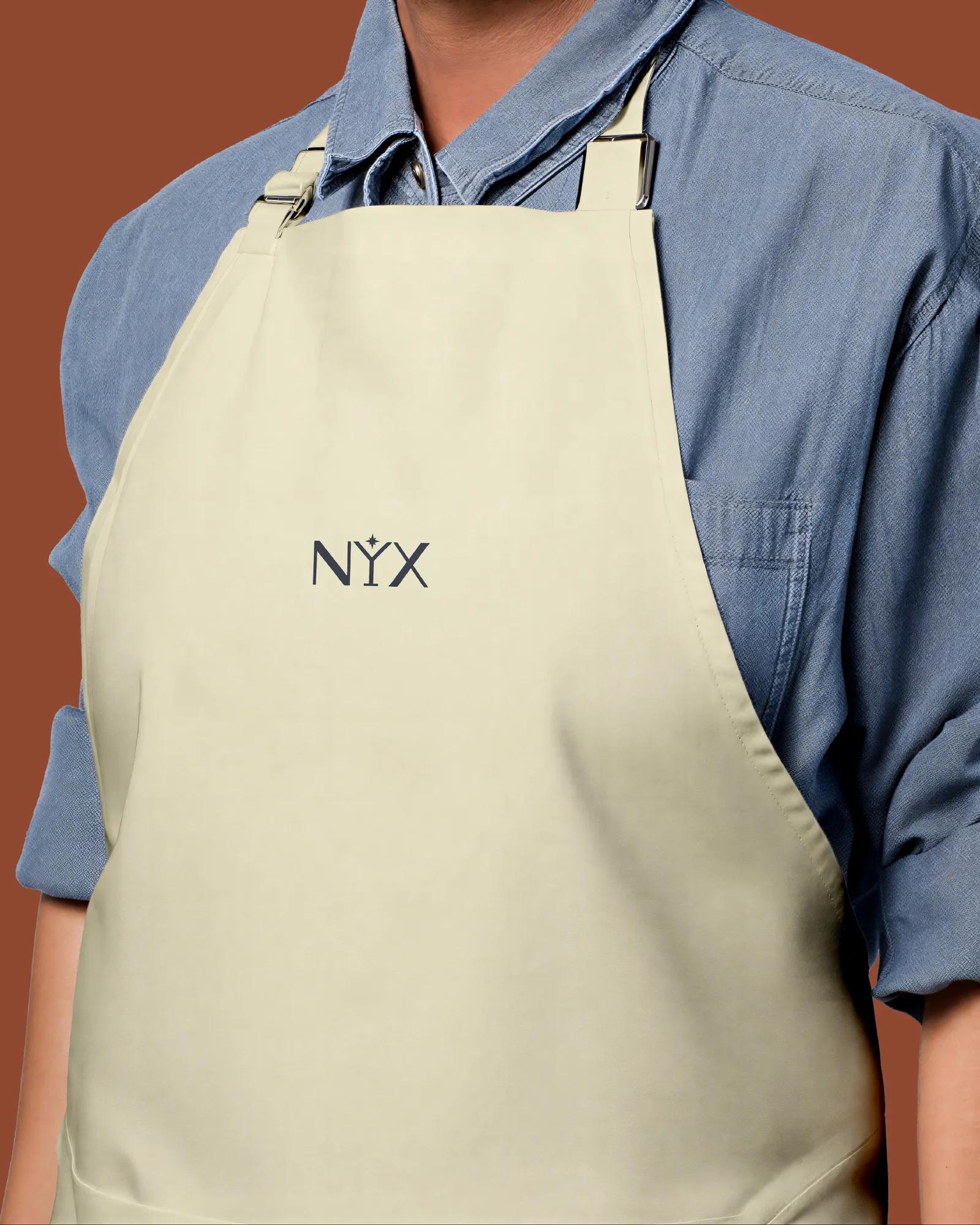
The identity also has to work small and everywhere: pressed into a coaster, etched on a stirrer, embroidered on an apron, lit up on a sign. If it only works large, it isn't doing its job.
The Approach
Nyx is the goddess of night, so the mark is built from the letters. The Y becomes a martini glass, and the star sits where the drink would catch the light.
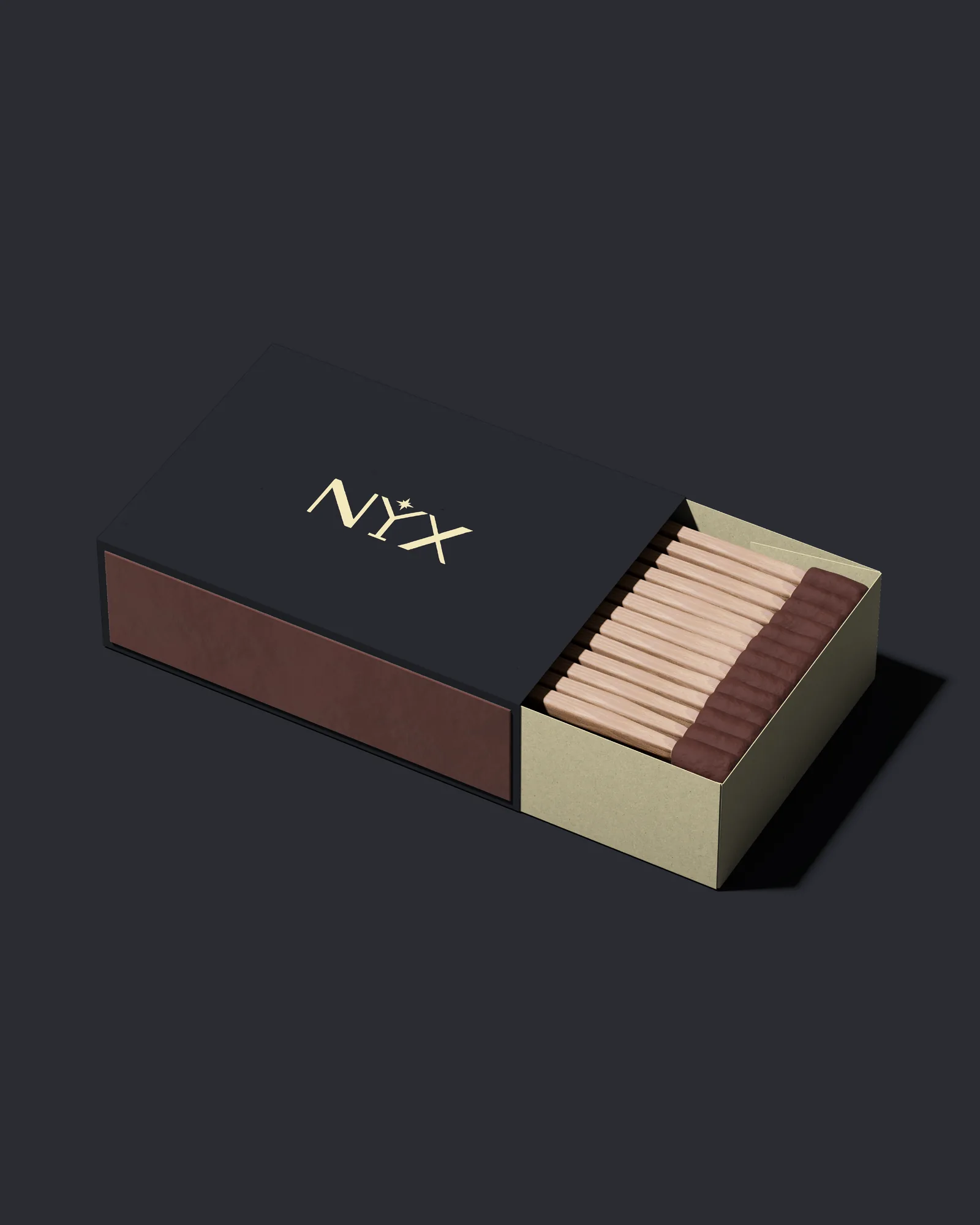
That gives two assets from one idea. The full wordmark carries the name where there is room. The glass and star work alone on the stirrer, the matchbox and the coaster.
The System
The palette is nine warm neutrals instead of black and gold: obsidian and espresso for depth, walnut and champagne for surfaces, and burnt clay as the one accent. They are the colours of low light on wood and skin.
Everything a guest touches carries the brand: menu, coaster, matchbox, stirrer, apron and the blade sign on the street. The same two marks repeat at every size.