Noor & Mould
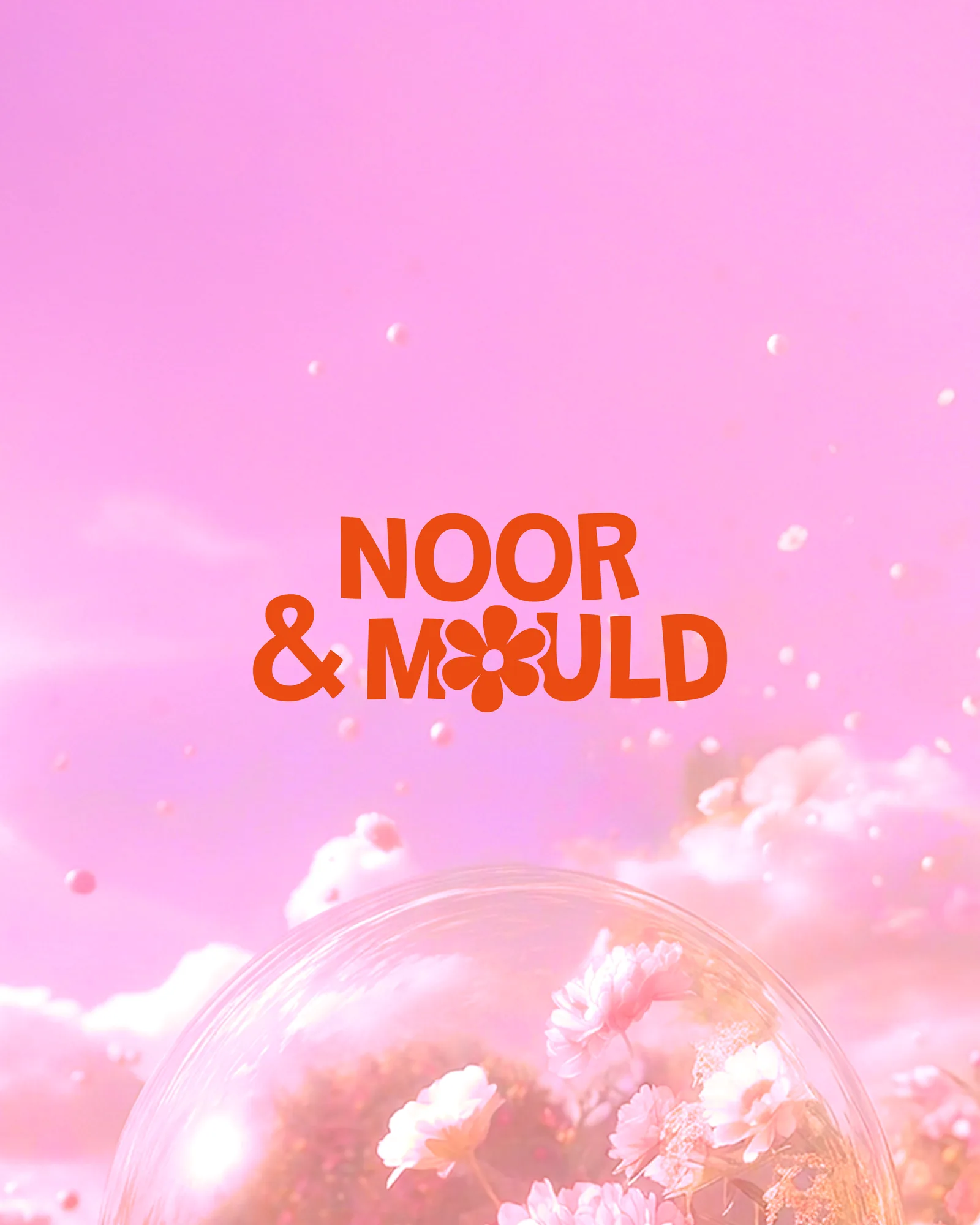
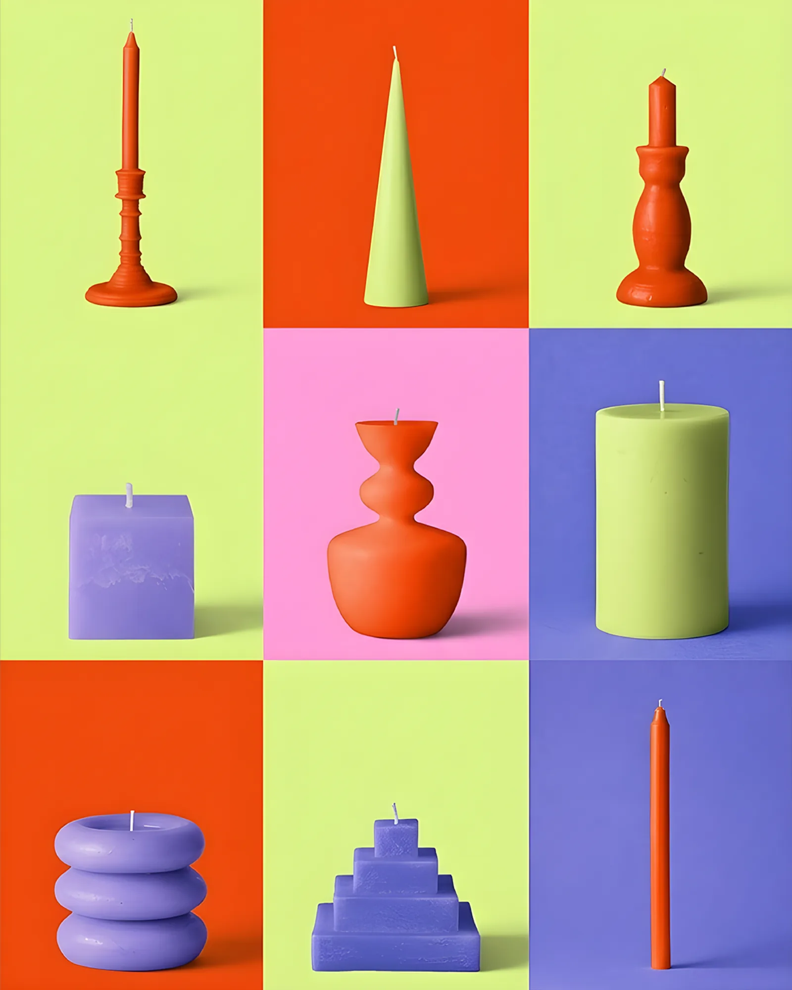
A candle maker where people come to pour and mould their own. The identity starts with the workshop: a daisy set into the wordmark and four bright colours.
The Challenge
Handmade candle brands tend to look calm: beige, kraft paper, thin serif type and plenty of empty space.
Noor & Mould sells candles, but the workshops are the draw. People come to pour and mould their own. A brand that looks like a product on a shelf sets the wrong expectation for an afternoon with your hands in wax.
The Approach
So the identity starts with the workshop and the product follows. We designed for a room full of people: colour you can see across a table, and a mark simple enough to press, pour, print or stamp.
The daisy replaces the O in MOULD. It is the logo and the shape of a mould at once.
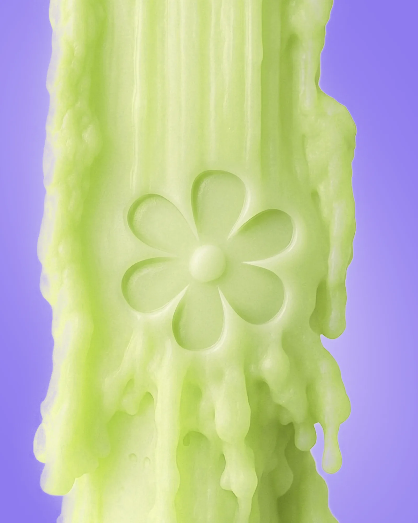
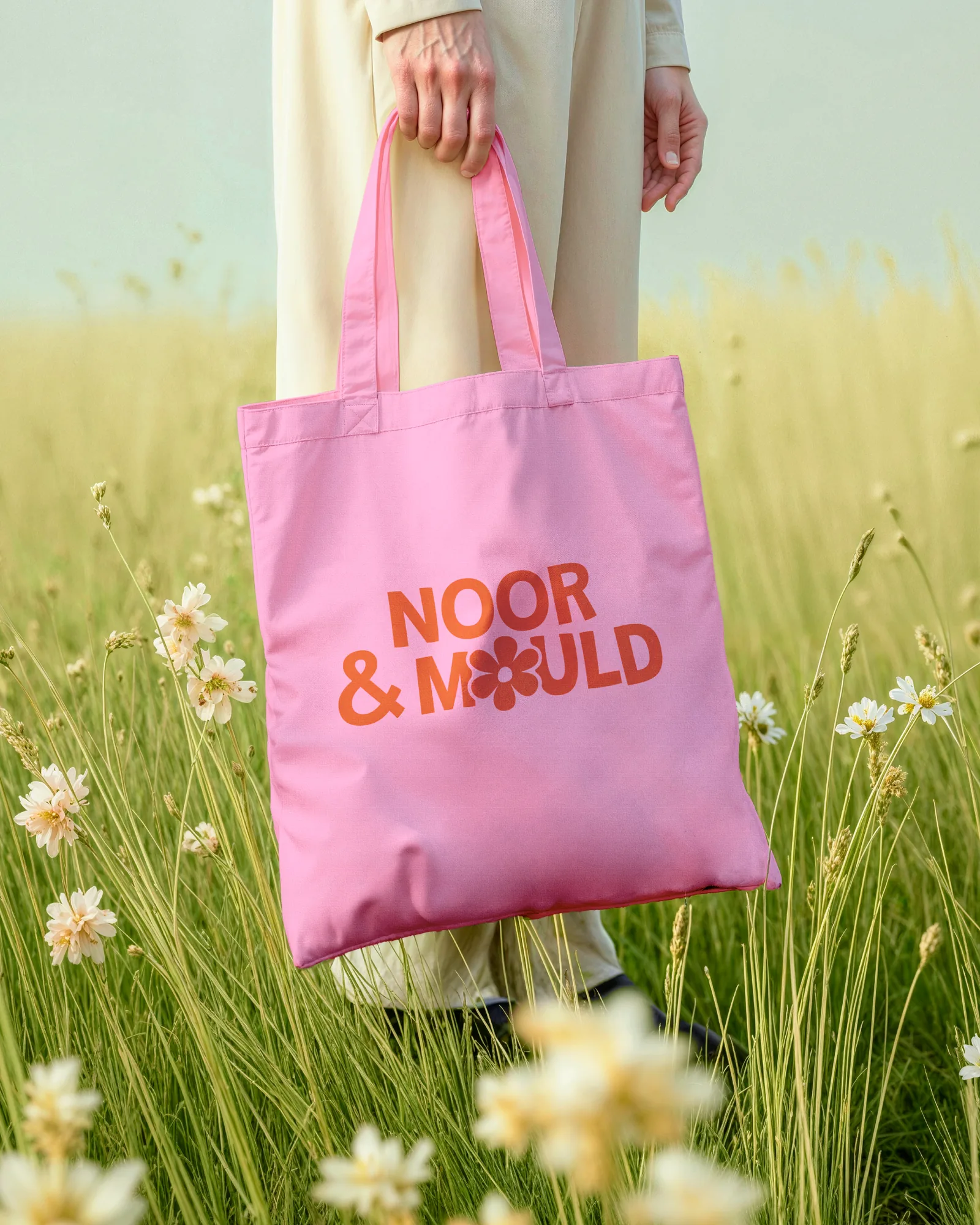
The System
Four colours (orange, chartreuse, pink and violet) take turns. None is the main one, so no batch or season looks off-brand, which suits a craft where every pour comes out slightly different.
The daisy repeats as a pattern where a surface needs filling and stands alone where space is tight. Packaging, totes and cards are designed as things people take home from a session.